Published:05. Dec 2015
・Activity 1/Tokyo Lighting Survey:Meguro River (04/11/2015)
・Activity 2/12th Annual TNT Forum in Mexico City (19-21/11/2015)
・Activity 3/Lighting Survey in Mexico City(23-24/11/2015)
Tokyo Lighting Survey @Meguro River
4 Nov. 2015 Kouki Iwanaga + Yuri Araki
Meguro Riverside is a famous spot for cherry blossom viewing in spring, and is one of the most stylish street for shopping and coffee. The street gets dim as a night falls, unlike other glittering neighborhoods. In spite, it still attracts people walking along; the dim environment doesn’t give you a feeling of danger. The survey was made to find out the secret of endearing darkness.

■Townscape along Meguro River
We surveyed a 1km stretch between Ikejiri-Ohashi Station and Naka-Meguro Station. Many residential buildings on Ikejiri-Ohashi side, more cafes and restaurants on Nakameguro side, and retail shops dominate in between. The area is controlled under a special regulation by the municipality to reserve the scenery of Meguro Riverside.
■Street Lighting


The variety of lighting poles and the light source are something to note. 5m high pole lights are allocated at each street crossing the river, and 3m high pole lights are constantly installed to cover the sections in between. What remarkable is its variety; those 5m pole lights are in seven different designs, assuming that those were installed at the same time though.
100W Mercury lamp is used for the pole lights on Ikejiri-Ohashi side. Illuminance on the street level was measured at 3.6lx right under the pole light, and at 0.6lx in the middle of two. According to the guideline by MLIT, it is advised to illuminate the street at 10lx or above considering elderly and disabled accommodation. This street may be technically dark, but spill light from shop interior makes the street visually brighter.
Only one pole light among all has a reflector and we assume it is to prevent the light spill into the residential building.
Nakameguro side is mostly consists of warm LED pole lights; the luminance was measured nearly at 900cd/m2. It is glary, but is comfortably merged in the surrounding shop lightings. Illuminance was at 22lx under the pole light, and 3lx in the middle of two. Compared to the area with mercury lights, this area is brighter.
We also found other area lit by cooler LED pole light and there were indeed variety of pole lights throughout the street.
(Yuri Araki)

■Supplemental Light

Great variety of elements consist the street along Meguro River; condominiums, offices, factories, cafes, retails, hair salons and book stores… sounds like a mall, but it is not something chaotic. When darkness falls into the town, each element starts dress up with light in its own style and it creates a rhythm to the dim, plain street.
Condominiums and apartments welcome the inhabitants with 100lx welcome matt light. Restaurants and cafes also draw passerby’s attention by 50lx light spilled to the street. Soft spilled light at 20-40cd/m2 is enough for people to be attracted to the shops and signage lighting are 80cd/m2 to gain more attentions.
There are nothing to glare people except for the headlight of cars passing once in a while, and each lighting element is well-mixed in the scenery.


■Conclusion
The lighting environment of Meguro Riverside may look unorganized in terms of its varied brightness, colour temperature and luminance. However, those pole lights and approach are well-matched with the complex of residential and office environment without creating glare or throwing violent light throughout the street.
Apparently, the overall lighting have been created by its own logic of illuminance which nature of each area required; those are not something blindly adapted under “brighter is stunning” theory.
Meguro River itself is left unlit assumably because there are few cars and pedestrians at night. So river does not require to be lit but remains dark. Instead, uplighted trees add soft ambient light, adding gentle light down to the street and the river, during Cherry Blossom season.
The lighting environment at Meguro River, consists of no unnecessary light, could be an ideal example to other roads and streets in Tokyo. Its dim but moderate brightness from the pole lights and those spilled from surrounding buildings may be the reason why it keeps attracting people.
(Koki Iwanaga)


12th Annual TNT Forum:2015 in Mexico City
2015.11.19-21 Noriko Higashi
The world’s most populous city, Mexico City. A city with a long history and lots of charm, this was the venue for the 12th annual Transnational Lighting Detectives Forum, the largest forum in the books yet. The theme was SENSING LIGHT – FEELING LIGHT. How do lighting influence our emotion? We had various discussions through three-day workshop.
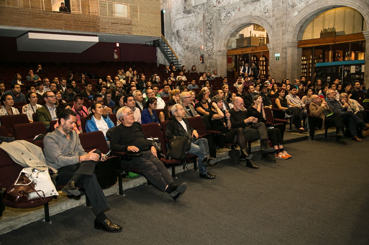
The Forum was held with 15 core members of Lighting Detectives from all over the world and Architecture students from the Universidad Nacional Autonoma de Mexico (UNAM) under the theme of SENSING LIGHT – FEELING LIGHT. Through night city walk with the local students, we examined how local citizens asses the Mexico City’s night scape and addressed ideas for improvements or upgrades.
■Day 1: Orientation
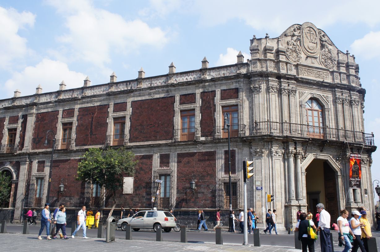
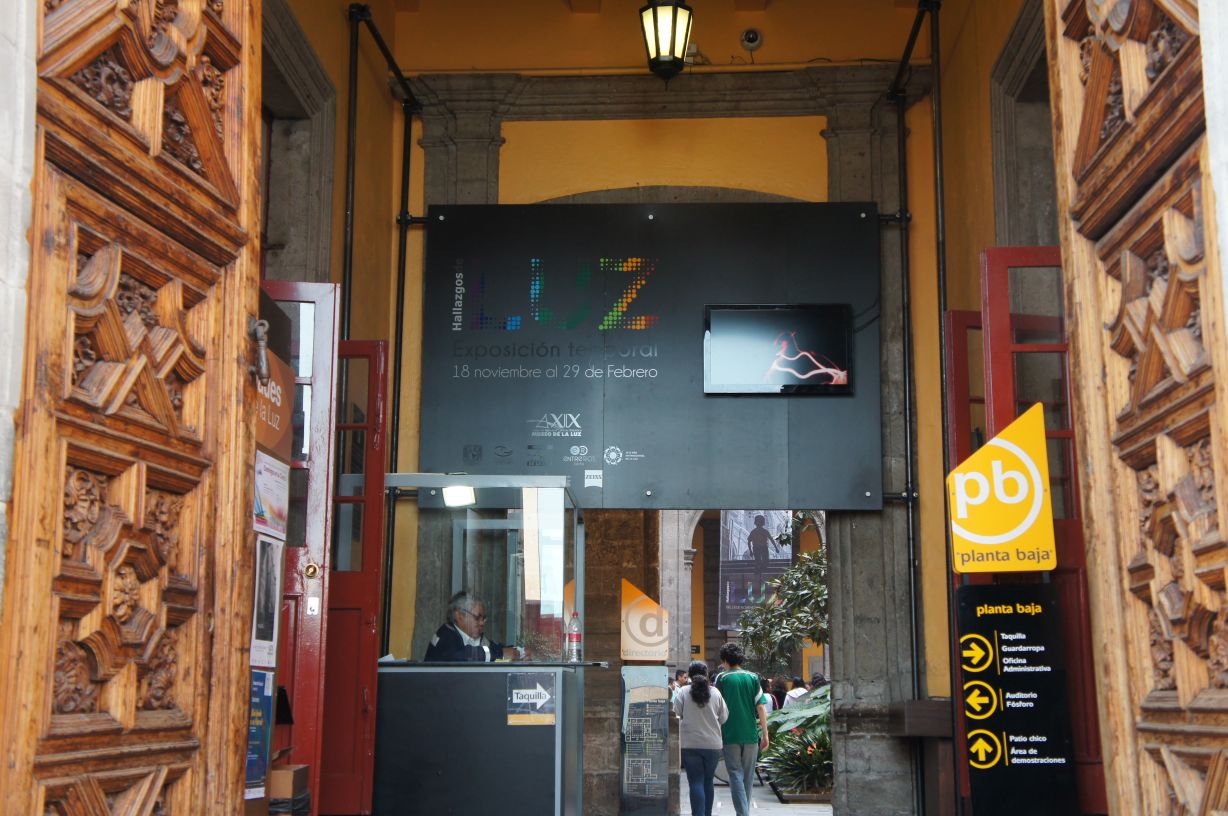
The orientation was held at Museo de la Luz (Museum of Light), a building over 400 years old. The workshop was kicked off by dividing into 6 groups of 10 participants and 2 TNT members. As soon as TNT members were introduced, teams departed for city walk, as participants had already studied the basics of lighting and had taken a preview of the area.
■City Night Walk
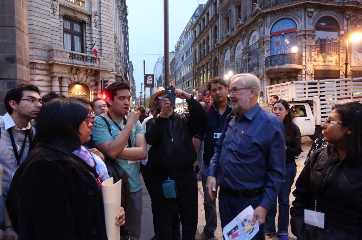
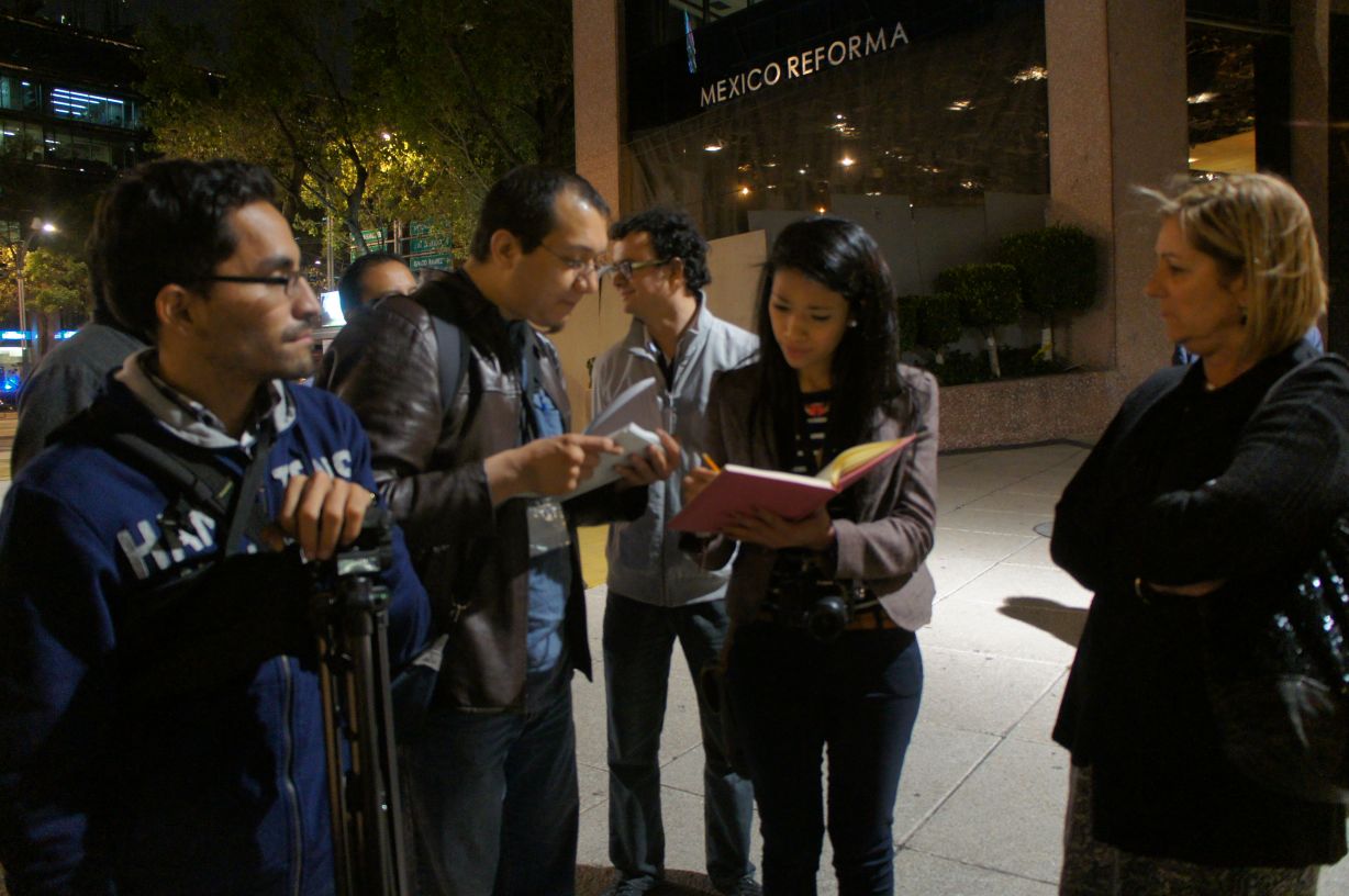
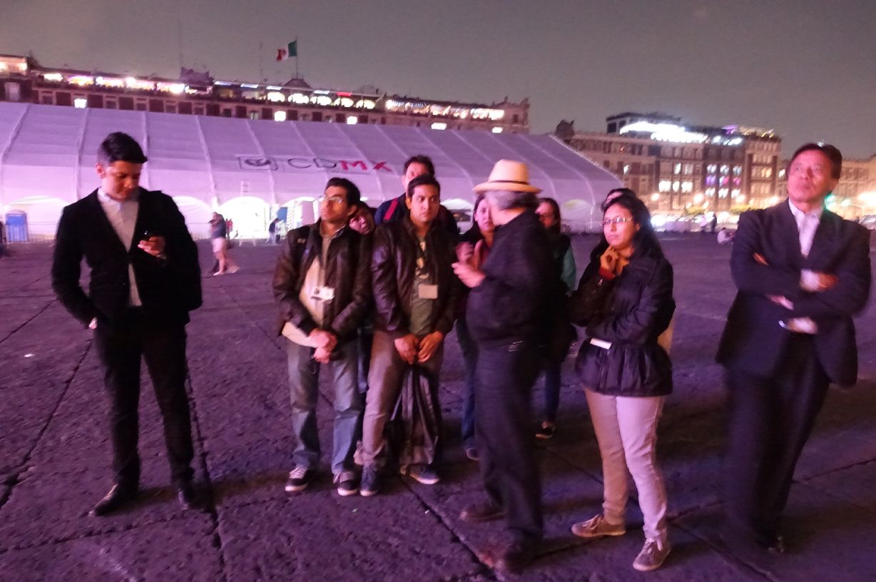
Night City Walk focused on six distinct areas in Mexico City. 1. Plaza Santo Doming, an area bustling with many people during daytime. 2. Templo Mayor area, an area of Azteca remains. 3. Madero Zocalo, the heart of historical district with full of tourists. 4. Alameda Park, the oldest park in Mexico City and is a local oasis and place of relaxation. 5. Revolution, the area near the Monument to the Revolution. 6. Reforma, the central business district. Each area is a heart of the city where people gather day and night, but also have visible problems with the night scape. This was the first night walk with bodyguards escorted each group. Stopping at one spot to another, participants listened to TNT members’ opinions and asked them questions. All teams were very active and enjoyed the City Night Walk respectively.
Day 2: Group Discussion
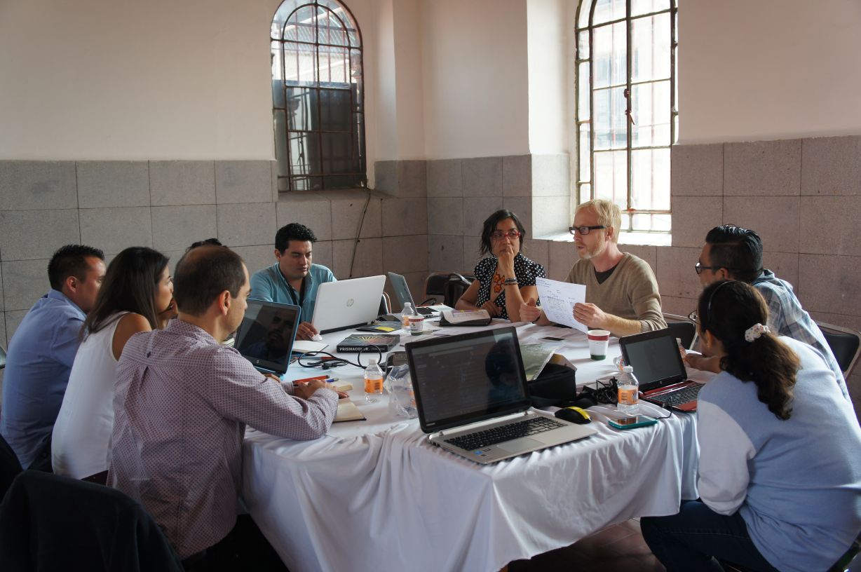
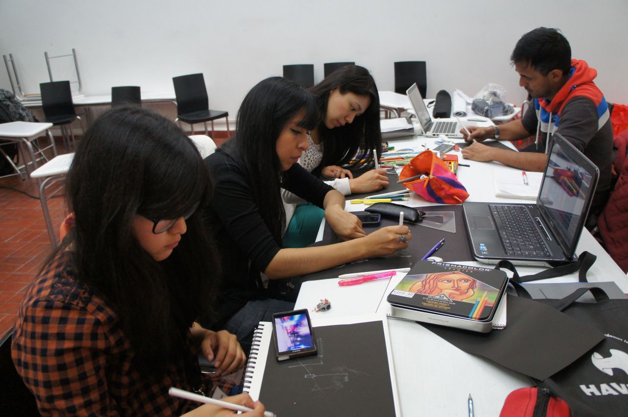
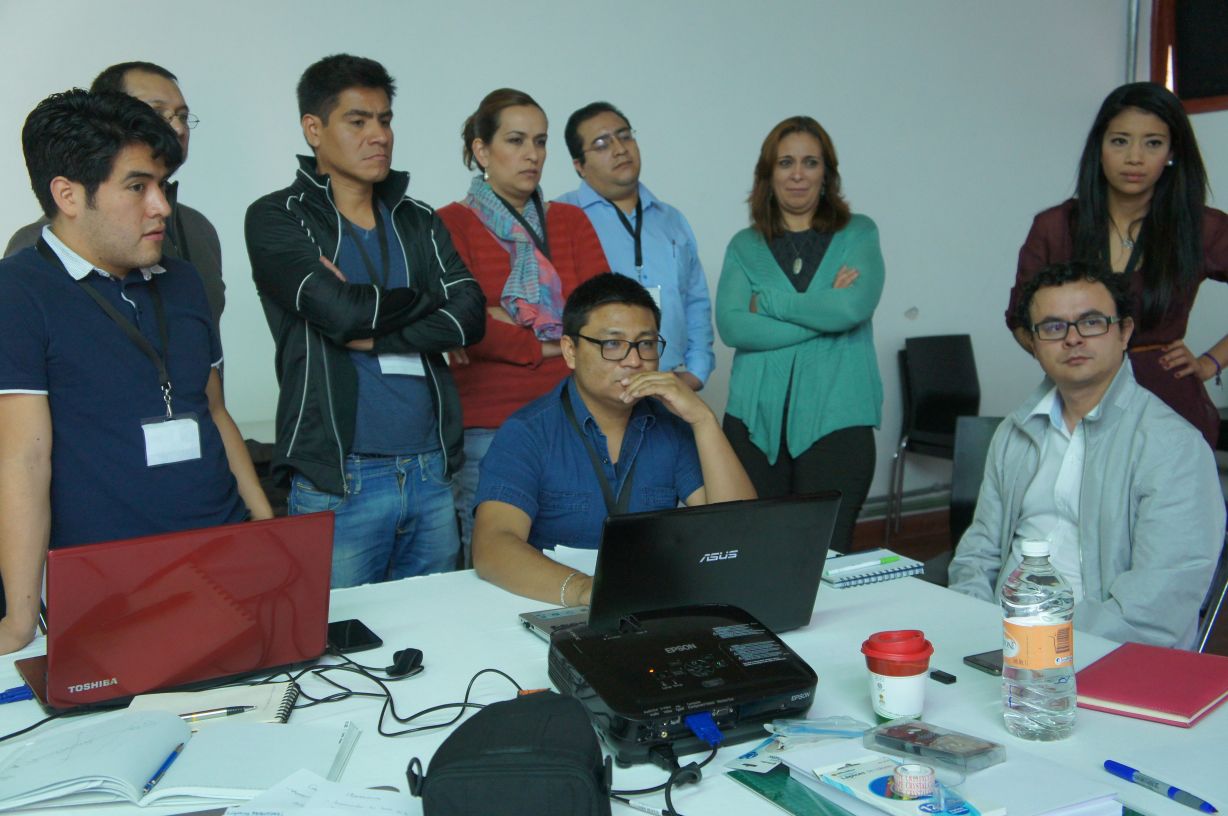
The next day, each team discussed on previous night walk. There seemed to be more time at this workshop than previous years, so each teams discussed in depth images taken on the walk. They worked on judging each lighting, to classify them into heroes or villains of light. Some shots were debated as heroes and also villains and the teams discussed on the decisive reasons/keys and made a final judgement as a team. The role of TNT core members was to support the team by facilitating the discussion, advising how to organize the presentation panels. The core members were just there to support, but not to lead the team in the workshop as it was important that local participants themselves to observe, organize the ideas and propose their own ideas to the city.
Day 3: Presentation
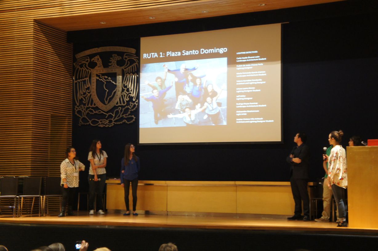
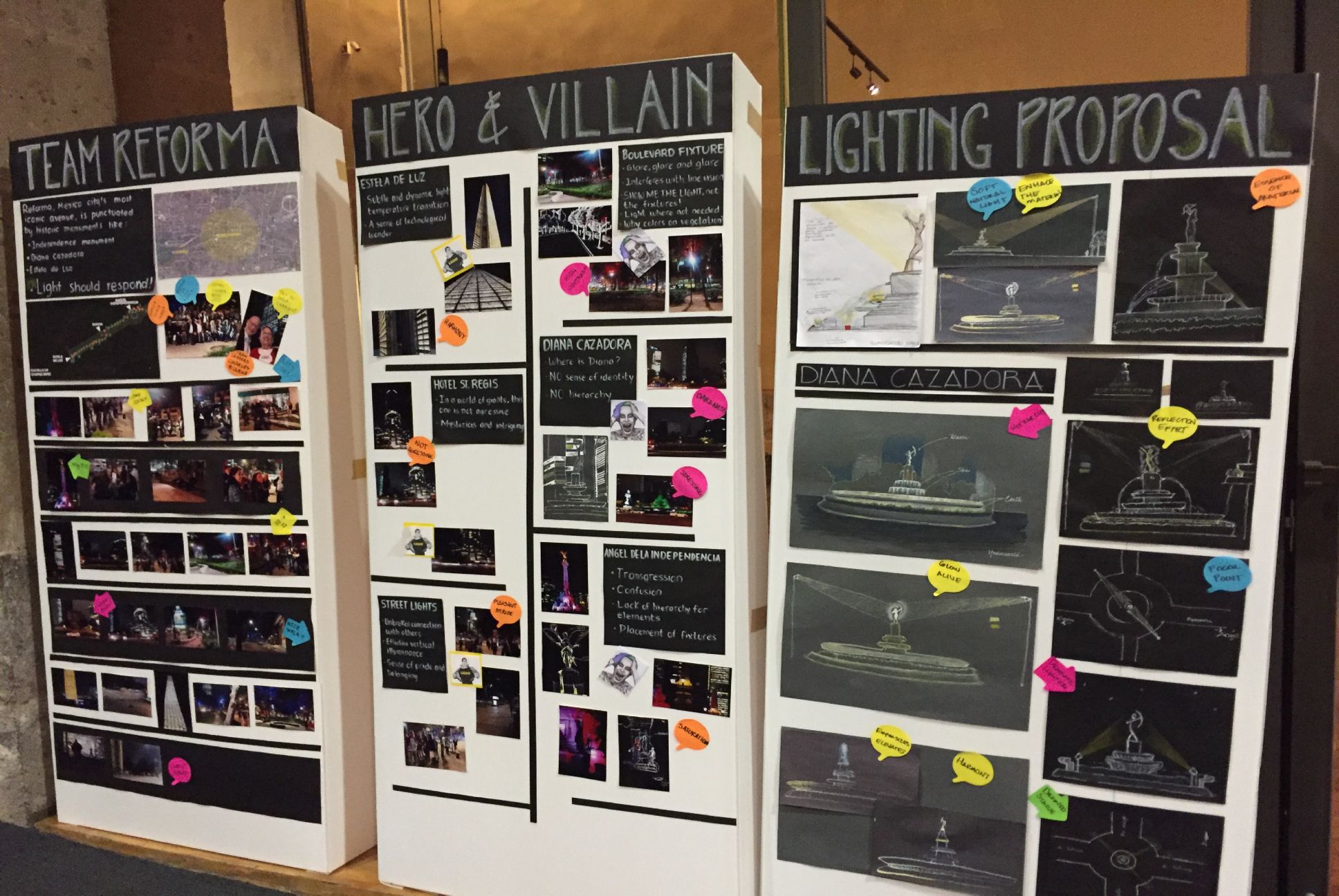
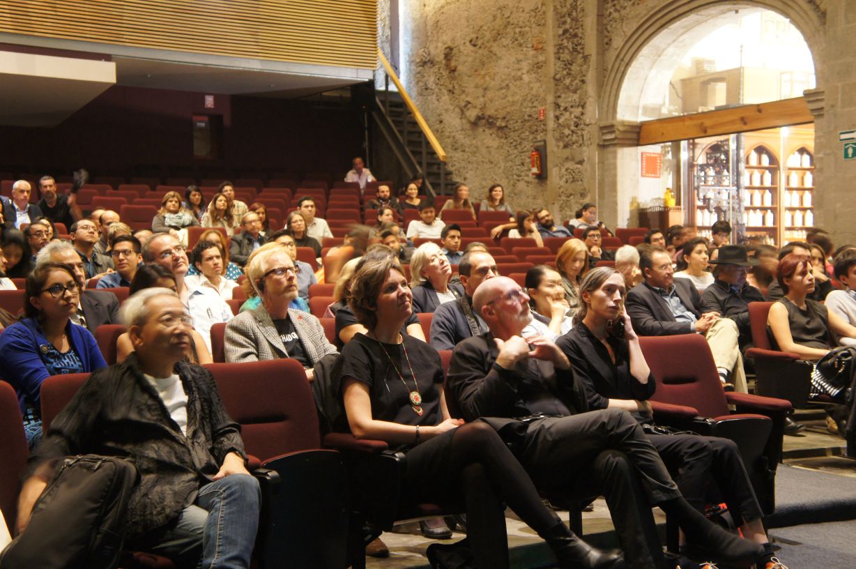
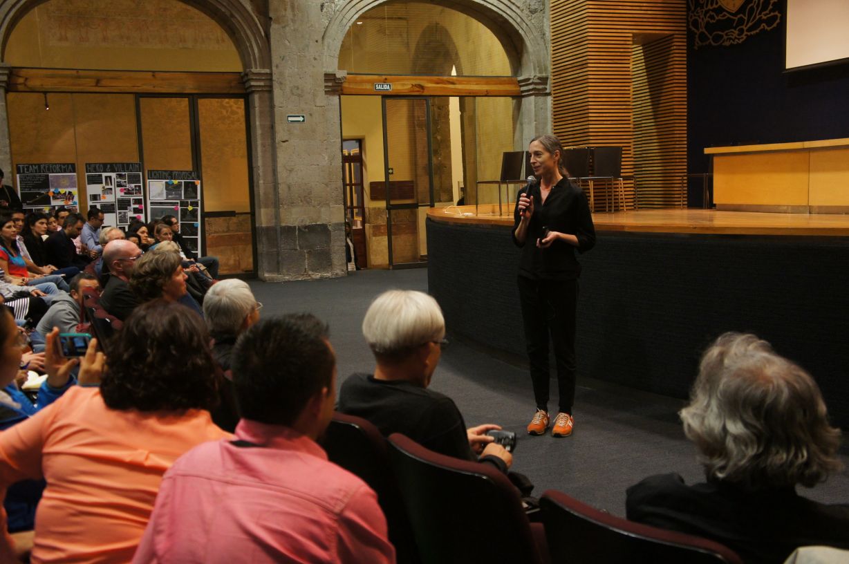
Each team put together a power point presentation with three large panels to introduce three heroes and villains selected. They pointed the problems and made proposals to solve them.
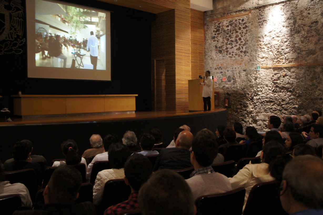
Team 1:Plaza Santo Domingo
The Hero was the plaza lighting which is giving visitors a comfortable outdoor-living environment. Street stalls giving soft ambient lighting and an iconic lighting to the building was also introduced as heroes. On the other hand, dark spots spread like black holes, overlit streets and the glary lights spoiling the dignified church were classified as villains. Explaining the history and background of the place and its role in the city, the team proposed how to create a comfortable night light scenes; how to create the hierarchy of lighting and spaces and to allocate high-performance luminaires.
Team2:Templo Mayor
Templo Mayor is the origin of Mexico City’s history. Lighting for heritage, nature and culture were three keywords of their heroes. The team introduced the keywords of lighting factor which local people in each area need. Keywords of villains were glare, bad lighting distribution and hierarchy; they pointed missing light where it was needed and glary light preventing important building to be outstanding. The team proposed to distribute light depending in hierarchy of the spaces.
Team 3:Madero Zocalo
Madelo Zocalo is the liveliest area in the historical district with small shops and restaurants. Noticeable lightings, characteristic, iconic, presenting lighting were introduced as Heroes. Unbalanced, glary and negatively excessive lighting were presented as Villains. Their proposal was to dim down overall and to control the lighting distribution. They also suggested to light up iconic buildings which were currently unlit, considering the spilled interior light so that the on-going activities would be noticeable by passersby.
Team 4: Alameda Park
Uniformity, safety and gentle light which protect local citizens gather in the evening were classified as Heroes. Colour lighting which didn’t match the place, unnatural transition of colour temperature and gradient, unbalanced contrast of light were the villains in this team. They made a lighting masterplan for this park and proposed to standardize the colour temperature, and to light up the iconic buildings and sculptures with a fine control.
Team 5: Revolution
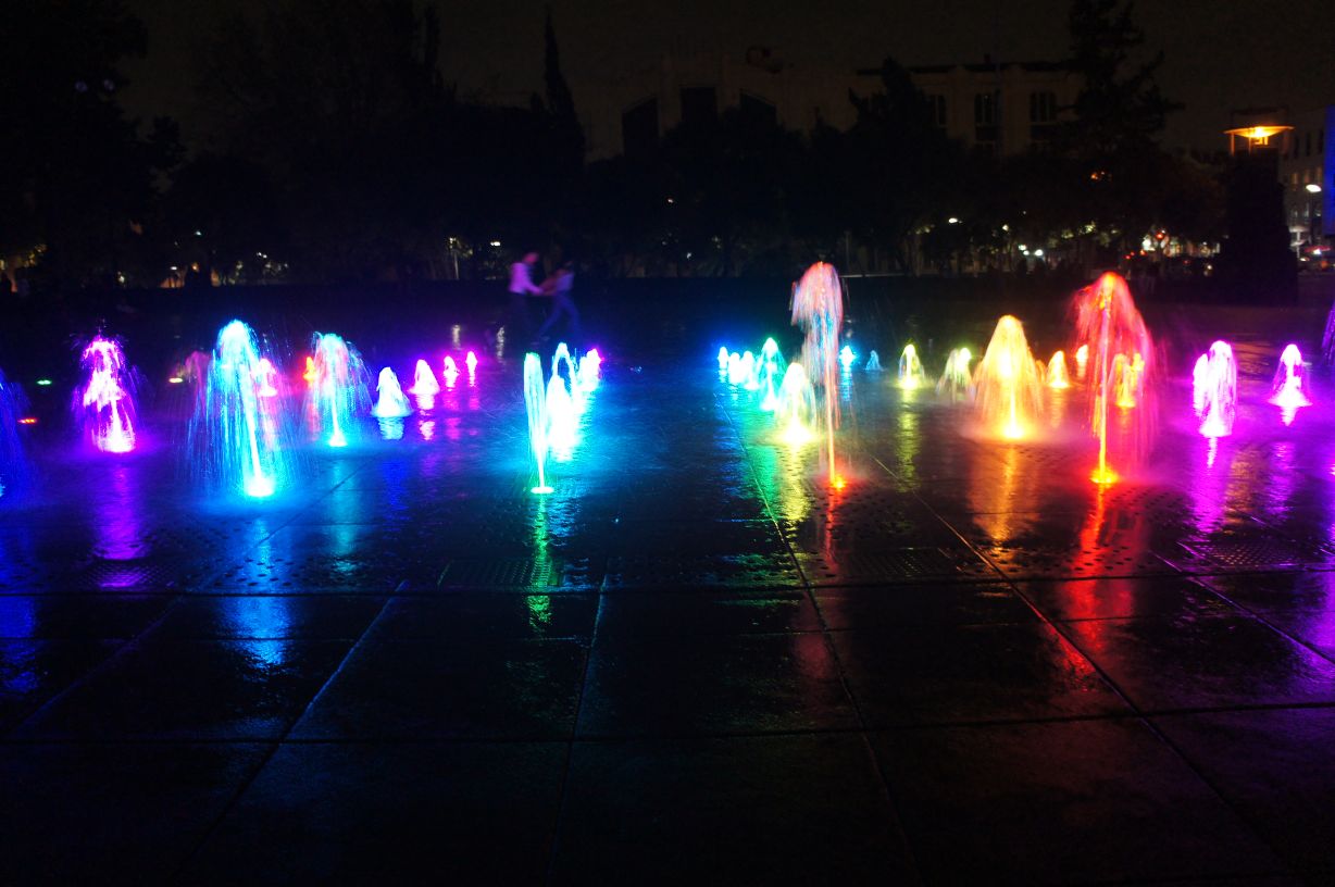
Revolution is an important district that major roads and streets meet. At the central point, the Monument to the Revolution was lit up in blue and the fountain nearby was lit by multi-colour LED light. Those lightings for the feature elements were in a big debate, with both positive and negative opinions, however both were judged as Heroes in the end as those were part of attracting night scenery to invite people. Villains were the uncontrolled glary street lighting and buildings insensibly lighted with coloured LED. The team proposed a lighting plan which added an impression of iconic street.
Team 6: Reforma
Reforma is central business and financial district. The heroes for this team were the lighting which was well-related to human emotion; lighting featuring the pride and identities of people. Colour lighting to the trees and luminaires with exposed light source and glary lightings were the Villains. All the team members presented the sketches of their ideas for improvements.
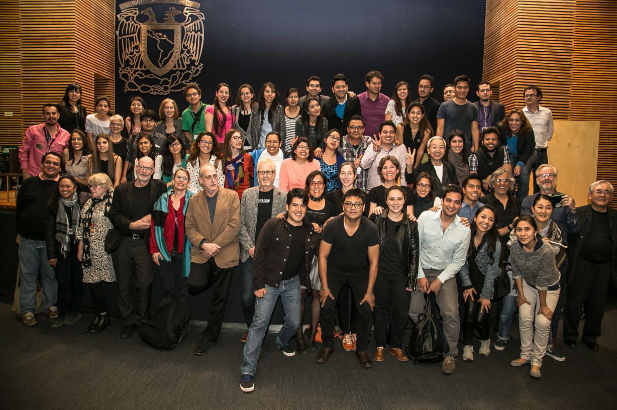
This forum, one of the official events of National Year of Light 2015, had participants from various field of professions; not only from lighting field but many from governmental and cultural authority of Mexico City and the local mass media. We saw highly motivated sprit in each participant to improve their city by understanding the historical value of Mexico City.
Participants showed us smiles of achievement after completing the proposals, going through the field works and discussions with Lighting Detectives core members.
“It was exciting three-day experience. By looking at the city through a filter of light, I learnt that there were problems and strengths of the city which I had never realized”, one commented. “There are lots of critical issues as imagined”, commented another. We received many other comments from participants, and hope they keep accumulating this kind of experience.
We look forward to seeing the proposals presented to be actually happened in Mexico City near future.
(Noriko Higashi)
Lighting Survey in Mexico City
2015.11.23-24 Mari Kubota
Mexico City, a city with many historical buildings and touristic icons. At the same time, it has been facing a problem of high crime rate, although it has been improving little by little in recent years. Would bright lighting be necessary to secure the city safety at night? Mexican culture has its unique taste in colours. How they develop their own culture of electric light and colours, and how the city will change with latest lighting technologies, are something to keep our eyes on.
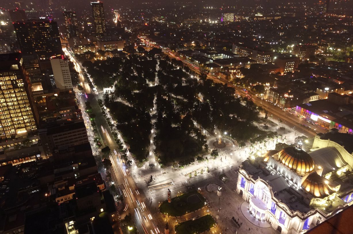
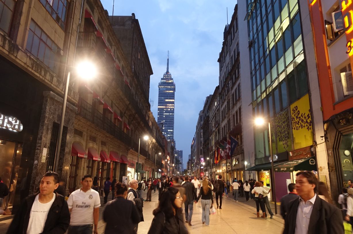
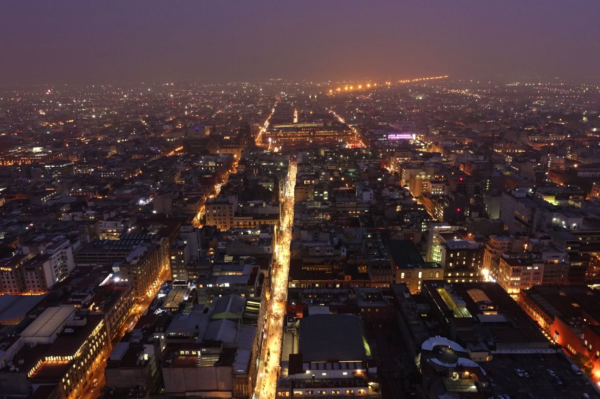
■The infrastructure has been reformed in these few years in Mexico City, especially in the district with historical buildings and monuments. Looking over the city from the 44th floor of Latin America Tower, which is located in the centre of the district, some areas clearly stand out by its brightly maintained lighting. Those brightness levels are set very high, at 60 lx at walkway and 150-200 lx at plaza lit by metal halide pole lights. On the other hand, Zocalo, the central square surrounded by the cathedral and the national palace, has no lighting installed and are only receiving little light from neighborhoods. It was measured 1 lx or below at the square. I, living in Tokyo, feel more comfortable with the former than the latter. The former is obviously overlit. A local architecture student commented it was way too bright, however, some commented “people can chill out in the plaza/park because of the brightness”, “brighter environment gives a feeling of safety”. Assume that comfortable contrast of light and shadow is not something needed, but safety and security are more critical in Mexico City when infrastructure is redeveloped.
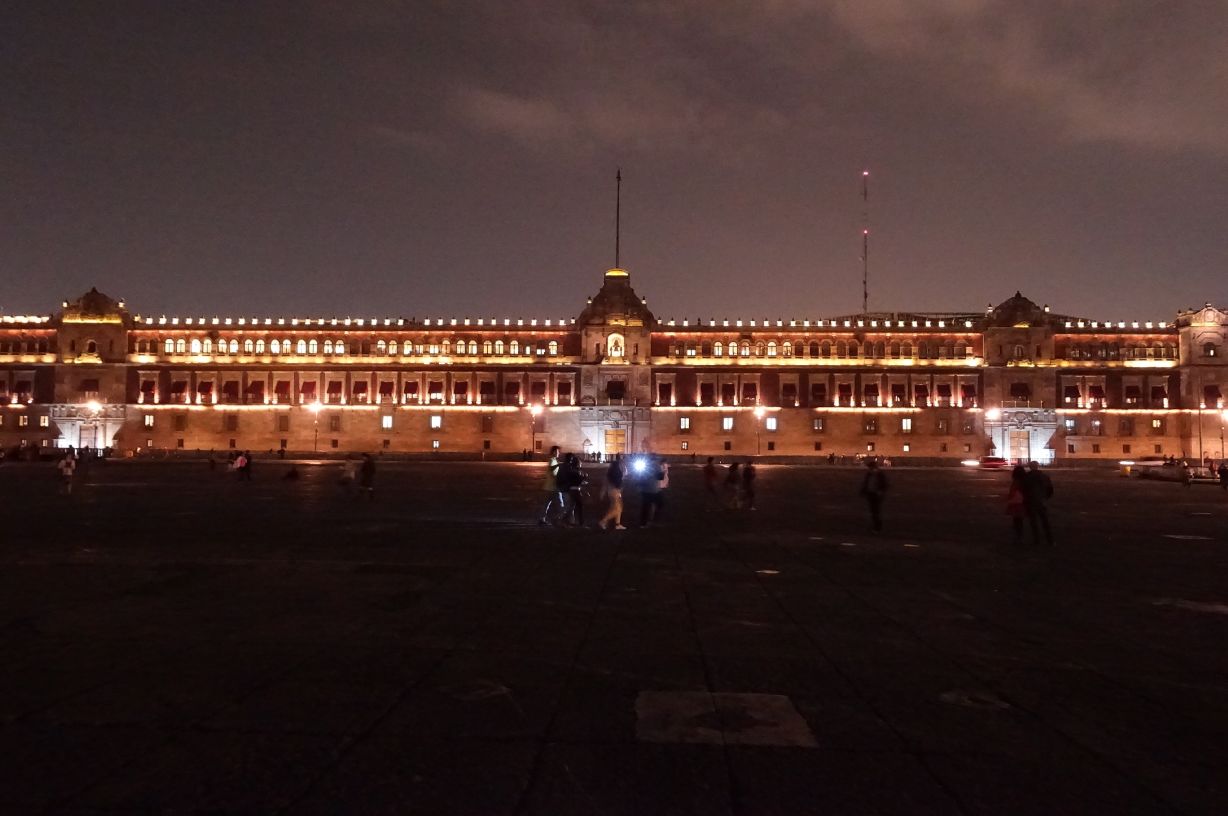
■Another factor to note is colour lighting for symbolic buildings and monuments. Not only the palace, monument of independence, and museums but also the fountains in the plaza and trees along the main street were lighted with colours. Those full coloured lighting were showing bad examples of the new technologies adopted to the city’s night scape; it even looked spoiling the dignity of historical heritages. Making a dynamic operation changes, from simple daily operation to specially coloured festive operation for instance, might improve the city night scape. Talking about colour lighting, I always think of Mexicans’ exotic colour taste. Pink, blue, green, violet and yellow…there are lots of houses and crafts in vivid colours. Are those and the scheme of colour lighting in the city related? It is interesting to see how their usage of colour lighting would be developed in the future.

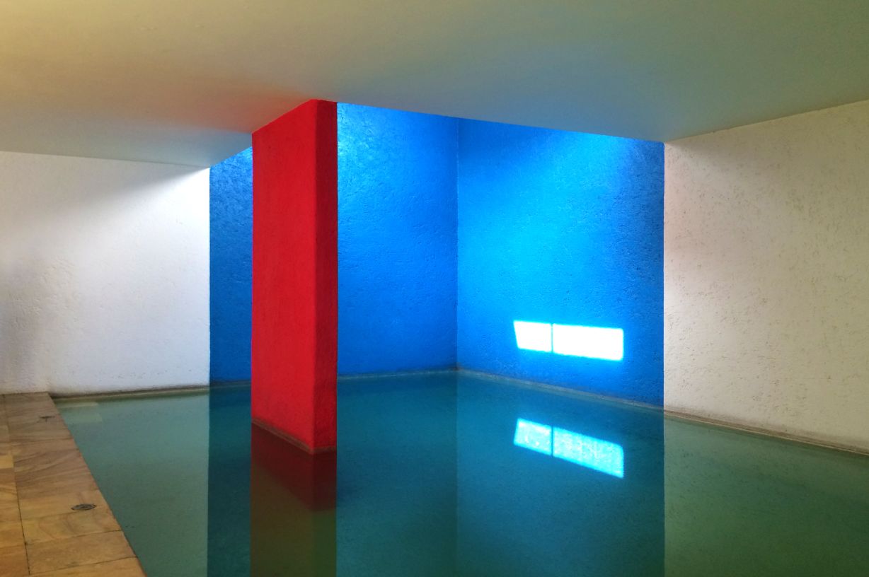
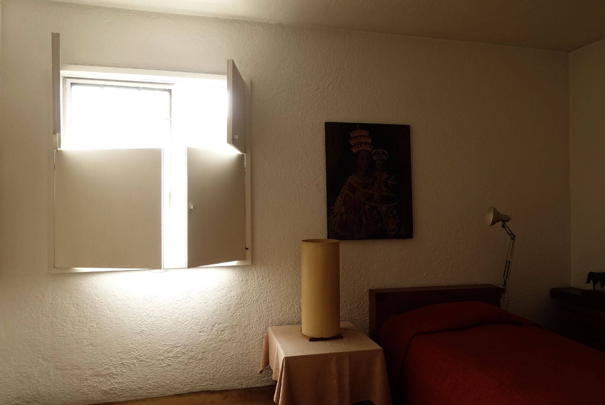
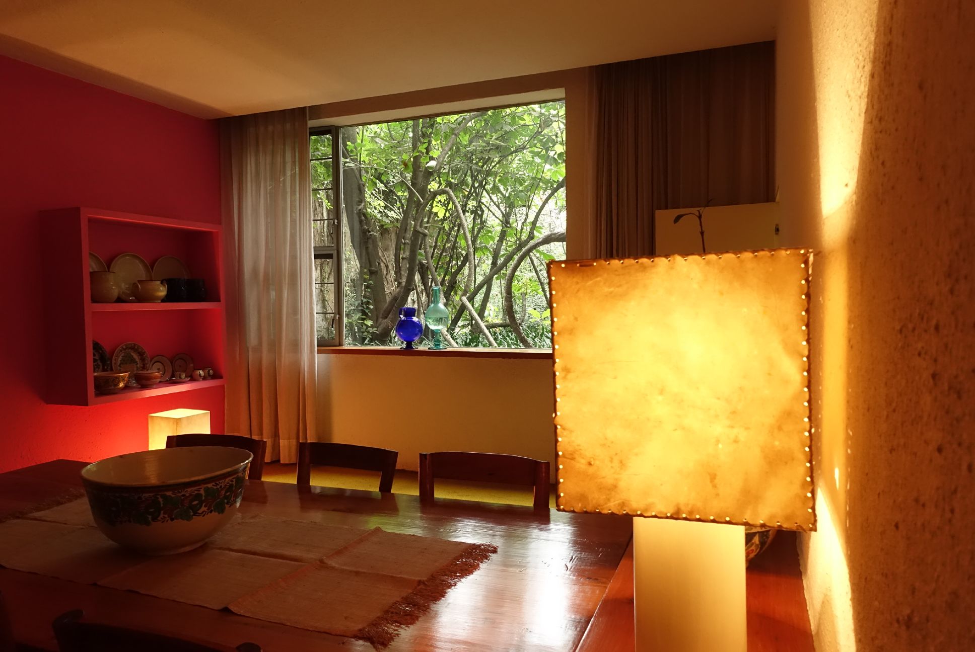
■Although the application of colour lighting in the city needs to be improved, the colour scheme and light in Luis Barragan architecture was amazingly beautiful. The wall in brilliant colour reflecting daylight, gradient of light and shadow on a modern white wall, and daylight coming through the pale stained glass… all those light and colours are perfectly planned. This experience has become my adoration to Mexican spirit.
(Mari Kubota)
