Theme: Media Walls and facade Lighting
Interviewer: Kyoko Takubo
Issued on October 31, 2011
Kyoko:Mr. Mende, today I have a problem and, if you don`t mind, I would like to ask for your advice. On a recent project, the client has requested a media wall style façade. To me, it seems that the client is not just asking for simple signage, but something I never expected from this particular project. Instead of a media wall, I want to design façade lighting that is more artistic and stylish. What do you think? Can a media wall be artistically beautiful?
Mende:Maybe, but the sole purpose of lighting design is not just designing beautiful nightscapes. If the client wants a design that draws in people, just beauty alone will not attract people. I don`t think we can call the project a success if nobody comes.
Kyoko: So I should design a place people will want to come to?
Mende: Commercial lighting design is not just about beauty. Rather because of the lighting design, the buying, selling and excitement of the area is what is demanded. It’s a delicate balance. Sometimes people are drawn to rather ugly places, however just because that is the case doesn`t mean that you should be able to design whatever you want. In commercial design sometimes the slightly wacky has just enough charm to draw in a crowd.
However, as lighting designers, we can add fun and awe and make the crowd say “Wow!” These might be important things to think about for this project.
Kyoko:What is the different between a media wall façade and façade lighting?
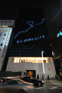
Mende:The days of just LED based luminous signage are over. I see a future, where the entire building will play a role in transmitting information. In general a media façade, relays text or graphic information in a fresh new way, but instead of just transmitting information, for example dimmable LEDs densely embedded in the façade could produce an even more entertaining outcome. The black and white abstract graphics of the Ginza Chanel building are a beautiful example, almost like environmental art. I love it!
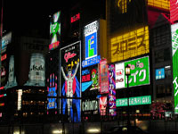
Kyoko:Yah!! The glare and gliz of Osaka`s entertainment district, Dotonbori, is so energetic! Whenever I was feeling down I used to take a walk there. I was an immediate cure!
Mende:In general, glare and gliz is frowned upon, but I think Dotonbori is extraordinarily welcomed example. Kabukicho and Shibuya Center Alley are also good examples.
Kyoko:I think it depends on the place. If any building anywhere was this bright and outrageous it might be a problem.
Mende:A city has several faces and each neighborhood a specific lighting demand. Not all urban lighting is equal, but various characteristics are dispersed throughout the city, a very good thing. The challenge is to pair the most suitable lighting with the most suitable place. If the lighting of Dotonnbori was to be used in a high toned area, Midosuji Honmachi, it might disturb atmosphere.
Kyoko:How does the lighting design respond to or compliment the surrounding environment is the ongoing question. No matter if it is a media façade or something else, selecting
Mende: Media façades should not only be eye catching, but it is also important to control vulgarity. Even if the wall is exciting and entertaining it still needs to have class. Lighting is used less and less to illuminate billboards, today advertising is written in light and high-intensity graphics are constantly bombarding huge screens erected in our cities. But this is not lighting design. Lighting design is sleek, it is energy conscious, and it compliments and highlights architectural structures. That is superb lighting design. Some media facades might fit into this category, some may not.
It might be time for new naming. Not flood lighting or wall washes, but the architecture is imbedded and sprinkled with little points of light. Genius operations would create beautiful graphics for a new kind of high intensity façade lighting that everyone will be talking about. That is the goal and LEDs have made it possible to use light in new and inventive methods. However, we are not graphic artists so we don’t want to go around arbitrarily slapping light graphics onto building facades.
Kyoko:I see. I think I have a clearer idea about façade lighting and I am eager to brainstorm for something new, stylish, and fitting for a media wall facade. I am ready to dig deep into my creative pool to produce a new and exciting design. Thank you for all of your advice today.


