Date of Issue:03 July, 2019
・Activity1/Vol.57 Night Walk:TX(Tsukuba Express)Area (05/12/2017)
・Activity2/Vol.55 Round Table Discussion (05/29/2017)
Vol.57 Night Walk:TX(Tsukuba Express)Area
The last developed major railway in the capital region, Tsukuba Express – The lighting for the development of railway line succeeded?
05/12/2017 Satoshi Tamura + Yusuke Wakata + Sinichi Sakaguchi + Tomoya Furukawa
More than 10 years have passed since Tsukuba Express (EX) was opened in 2005. The areas along the railway line, where used to be vacant sites at EX opening time, are being developed.
We explored the towns along the railway and new shopping mall to find out how the new towns have been developed from vacant sites, and how the urban lighting has been designed.
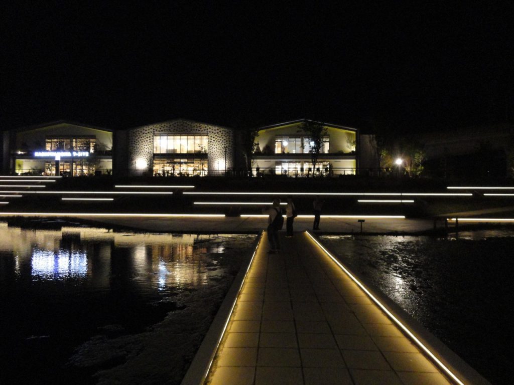
Kashiwanoha-campus Station : T-site
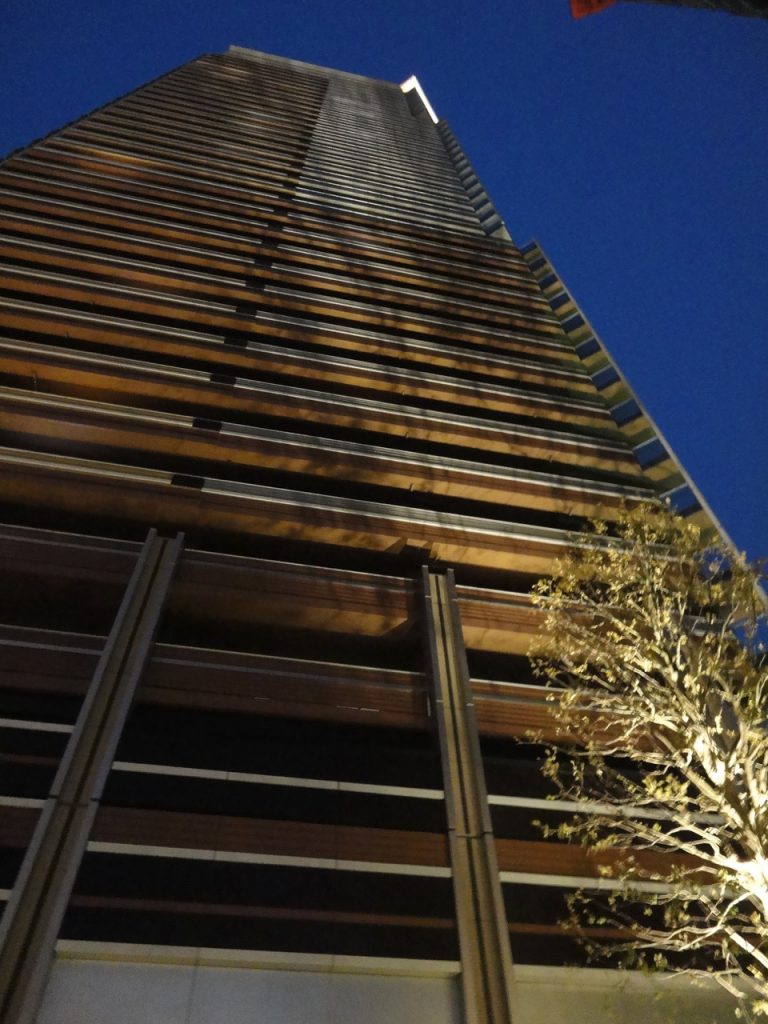
Apartment in Kashiwanoha : Does it affect for the balconies?
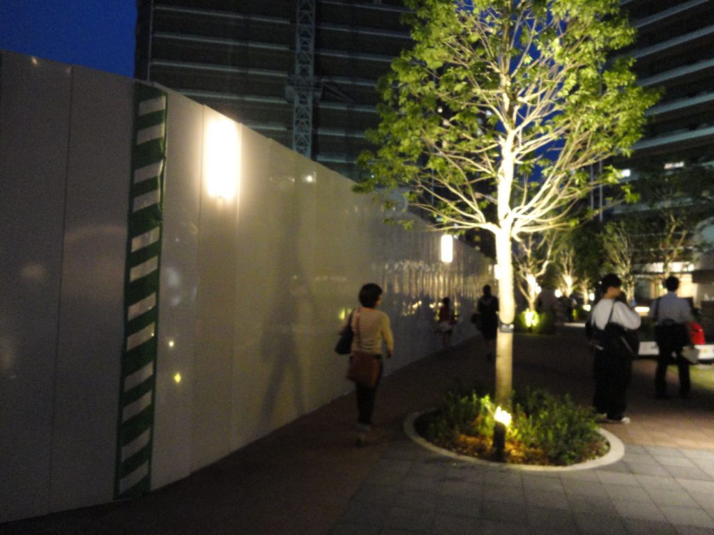
Kashiwanoha : Temporary lighting with 3000K for the boundary wall of construction site
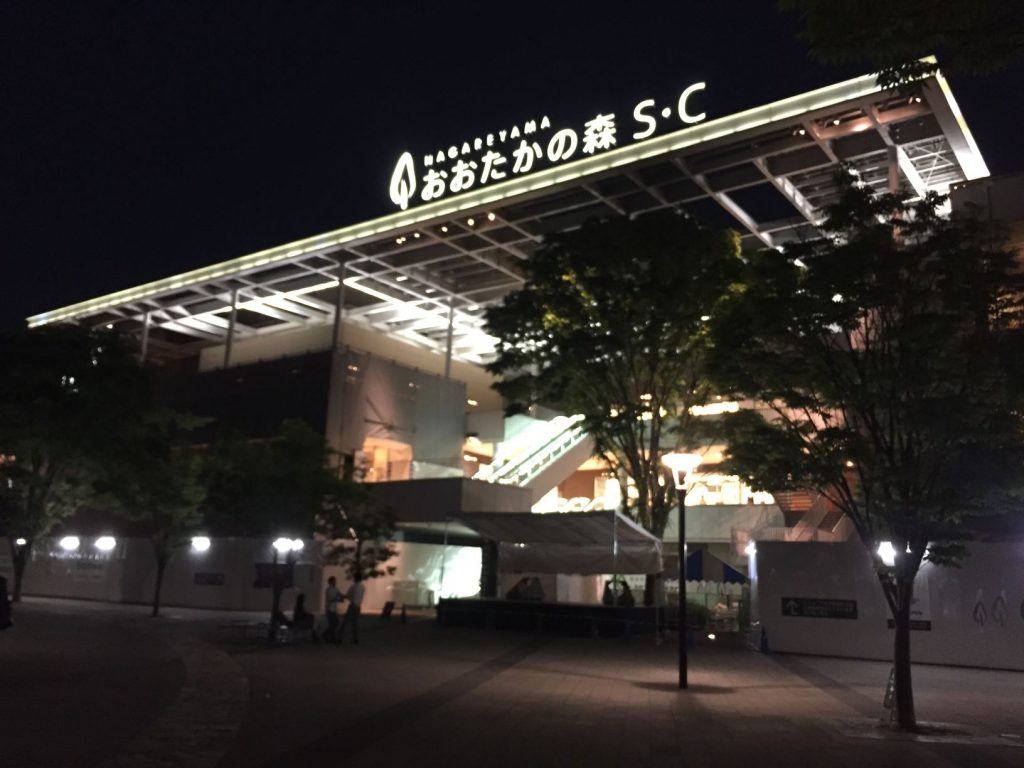
Nagareyama-ōtakanomori SC : It’s new and we liked the overall lighting
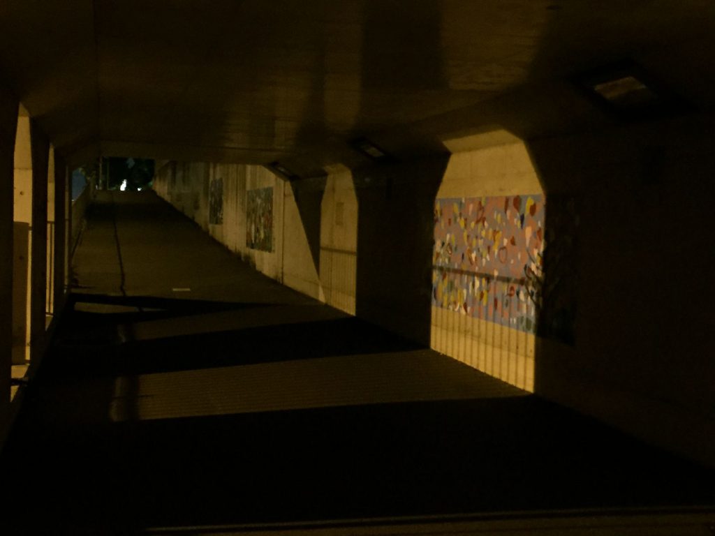
Nagareyama : The dark road in the old residential area
■Group A : Kashiwanoha-campus Station
We walked around Kashiwanoha-campus Station. (Station square→LaLaport→Mitsui Garden Hotel→High-rise apartment area→T site→Station square)
This area was designed as “Smart City”, and uniform color temperature using 3000K. It looked comfortable mood, and we expected we could find a lot of Heroes.
The followings are “Hero and Villain”, which we found in this city walk.
The designs of light pole in the station square and at the bus stop looked nice and we liked them. On the other hand, the lighting of the platform of TX didn’t look nice.
The lighting design of high-rise apartment area was uniform, and it made cozy atmosphere for residential area. We were surprised at the temporary lighting at construction site, which were designed with 3000K to suit to the surrounding. We learned this kind of conscious were important.
The tree up lighting in the square looked good, but it affected the balconies of apartment. Thus, some of us commented it is a Villain.
The lighting for T-site was sophisticated with minimal lighting at pivotal points. We thought it came with a twist under the limited bugged, and we appreciated. Also, all of us appreciated the lighting for the outside regulation pond as a Hero.
Most of participants of this time joined city walk for the first time. They commented, “We enjoyed to view and discuss on the lighting, which we had rarely paid attention to. We learned a new perspective to view lighting.” After the city walk, we could compare with other satiations explored by the other groups at the salon. We found city walk at suburban area was also enjoyable, but not only city area.
(Satoshi Tamura)
■Group B: Nagareyama-ōtakanomori Station
We started to walk from Nagareyama-ōtakanomori Station while comparing the new residential area and the old residential area. This station is just under 10 years old, and it looked new and clean. However, the light sources of indirect lighting were visible, and we felt the installation was rough. The shops at Nagareyama-ōtakanomori SC seemed designed with details. The street and the plaza in front of Forest Residence, which some of tree up lights were off, were very dark. However, uniformity of the base lighting of its entrance with downlight looked good, and we felt the building itself lighted. The carpark and the road in the new residential area were illuminated well with suitable brightness for the security.
On the other hand, the old residential area looked forlorn atmosphere. Some of road lights were off, and we thought the brightness were not enough for the security.
Overall, both of new and old residential areas have some problems. We wish they are taken care and improved to be safer and more vibrant.
(Yusuke Wakata)
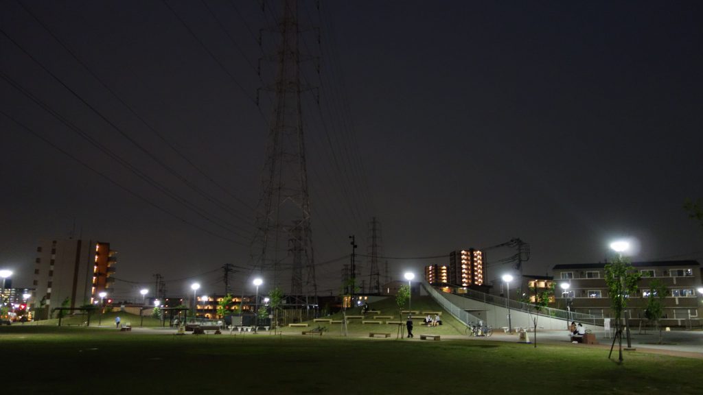
Yashio Park
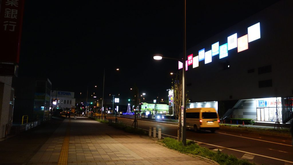
Yashioekimae Street : Low color temperature street light
■Group C: Yashio Station
Yashio Station is the last opened large railway station in the capital region ten years ago.
It used high color temperature, and other TX stations were similar.
There were no lights for the signage of Yashio station and we couldn’t see the station name at the night. It was not sufficient as eye-catch for the face of station.
Shopping mall and high-rise apartments stood around the station, and some of them were under the construction. The area was being developed as very bed-town.
The lighting of the surrounding shops used different color temperatures. Some restaurants used low color temperature, and some used high color temperature and were very bright. We felt the lighting of new high-rise apartment looked calm.
We thought Yashio Park could be better impression if the lighting were improved.
The shopping mall in front of the station was illuminated with very “shopping mall lighting”. It might it was aim to attract people with the brightness at the night.
Some of tenants looked designed with calm lighting, but some of them looked just using fluorescent light.
We thought it was better the government considers some standards for the light planning for the urban planning.
(Shinichi Sakaguchi)
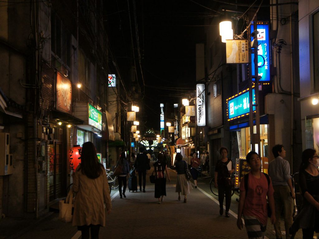
Kitasenzyu : Syukubamachi Street
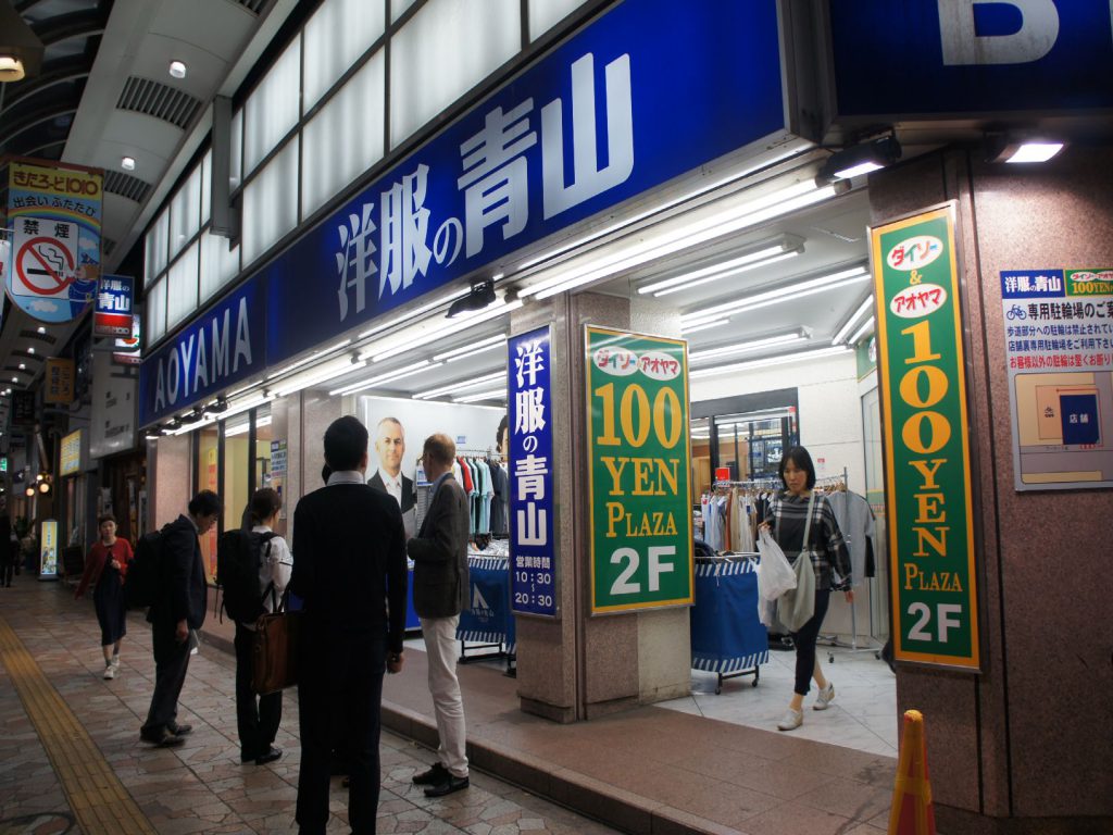
Kitasenju Kita Road : Most glare light in the street
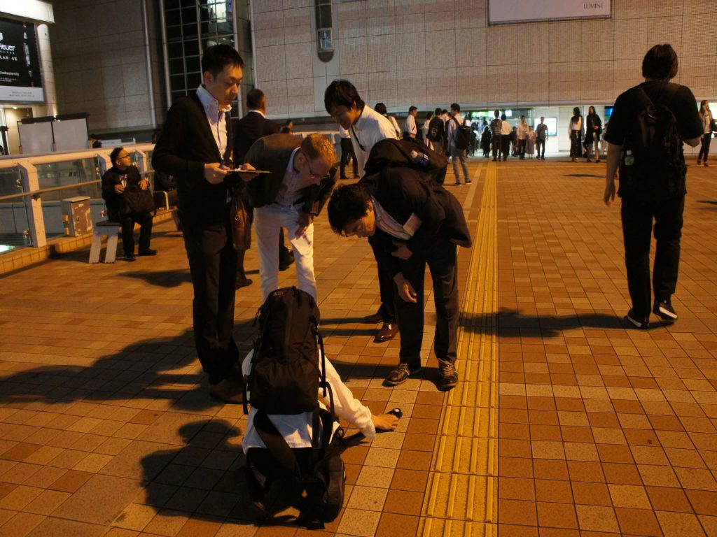
Lecture how to measure lux level
■Group D: Kitasenju
Kitasenju is one of Edo four post stations, and it is called Senzyuyado. The East side of the station has a shopping avenue and has remains of old houses along the street. The West side area has Tokyo Denki University which were built by the re-development.
We walked both of these areas.
First of all, all of us called Syukubamachi Street in the East side as a Hero. The light poles were attached the map of the way from Senzyuyado to each past station. Even on the same street, the designs of pole, brightness and color temperatures were different among the neighborhood associations. The front part of the street was 75 lx and 3000K, the forward part was low lux level and high color temperature with Suzuran light. These combination made perspective and we were guided forward the street. A member felt nostalgia and melancholy feeling with a neon signage on an old bar like a movie set. We called the followings as Villains. Light poles with glare LED light source, an outfitter shop facade with over bright light by white fluorescent light (1500 lx, 4500K on the shop front road), a noodle restaurant with LED glare up light for the signage.
The design of university in the West side was modern, and the façade lighting was suitable for the building design. Study area and relaxing area were separated by lighting designed with different lighting mood, and this zoning with lighting looked efficient. The lighting for the ally was minimal and the light source was concealed. It achieved enough safety and calm feeling.
We had some members who came from Osaka. In this survey area, downtown area and new university area exit together. They felt residents’ energy in this coexistence.
(Tomoya Furukawa)
We found good points in these four station areas, but most of members felt there were still problems to improve.
Next city walk is at Kamata on August. Please join us.
(Noriko Higashi)
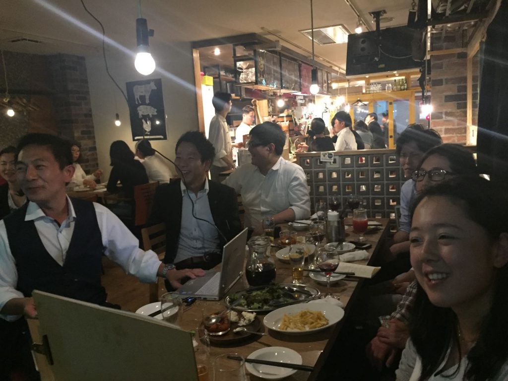
Gathering after the city walk
Vol.55 Round Table Discussion
Review on city walk in Tsukuba Express Area
05/29/2017 Noriko Higashi
We held a review on the city walk in Tsukuba Express Area. Did we find to our answer to the key thesis, “The last developed major railway in the capital region, Tsukuba Express – The lighting for the development of railway line succeeded?”
We held city walk in Tsukuba Express Area on May. 15 members joined. It was not many, but we could have deep discussion.
We had four groups, which walked the following four areas. Kashiwanoha-campus Station, Yashio, Nagareyama-ōtakanomori, Kitasenju. Some members commented it was difficult to find Heroes.
The railway line area and its surrounding areas are being developed since EX was opened on 2005.
The access from Tokyo to Tsukuba got to be convenient. Along the railway development, new shopping malls and high-rise apartments have been developed as well. However, lighting planning has a lot of problems.
We found very glare lights which were wasting energy. On the other hands, we found some areas, where there were not enough light for necessary points, were very dark.
New apartment lighting looked designed well, but parks were too bright or too dark and not conformable. It seemed there were no guideline of lighting for commercial buildings, and we didn’t see unity among the buildings as one town.
It was appreciated that light poles around the stations were suitable color temperature and brightness.
As our answer to the key thesis, we concluded the light environment of the towns was not good because there was no guideline.
We thought city walk which we compare some stations was very interesting way, that we could learn a lot of things in a short time. We would like to have this kind of city walk in the future as well.
We usually have a casual review at gathering at a restaurant after the city walk. And we have a presentation of what we summarize our comments and ideas on what we found. At every salons, we have interesting presentations with power point, but only a few pages can be shown in the reports. We would like to show you the presentation documents in Lighting Detectives web site.
(Noriko Higashi)
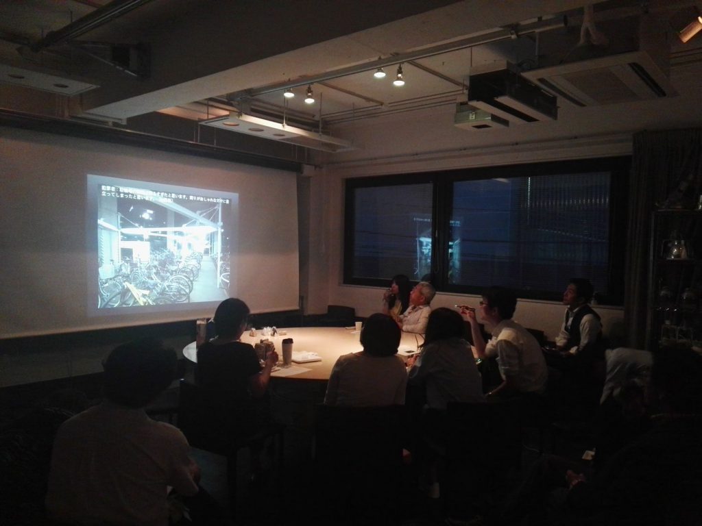
The group leaders presented the summaries
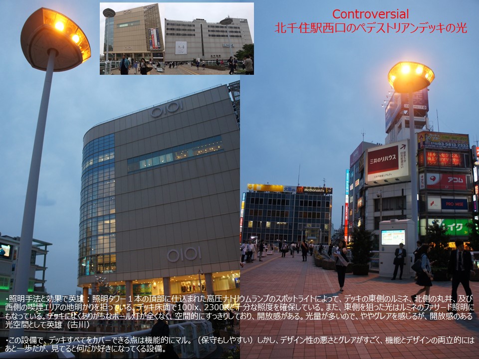
Presentation power point of Hero and Villain
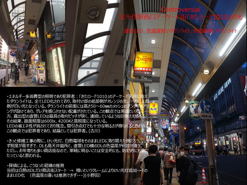
There were many lightings which they couldn’t judge whether Hero or Villain
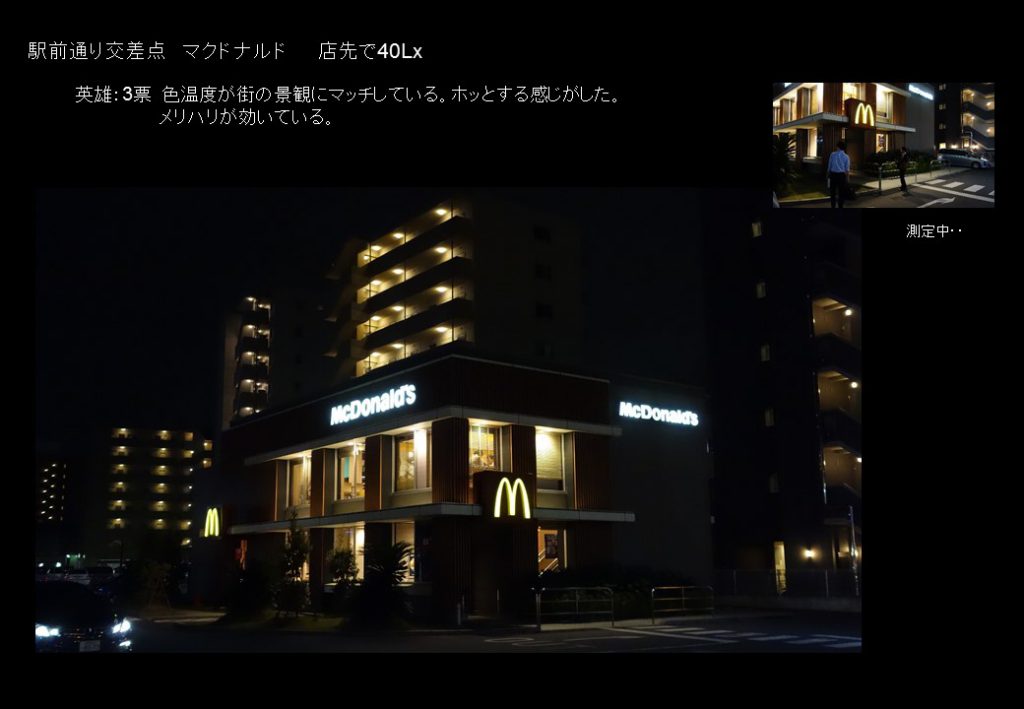
Everyone appreciated MacDonald’s shop lighting, whose color temperature suited to the surrounding residential area
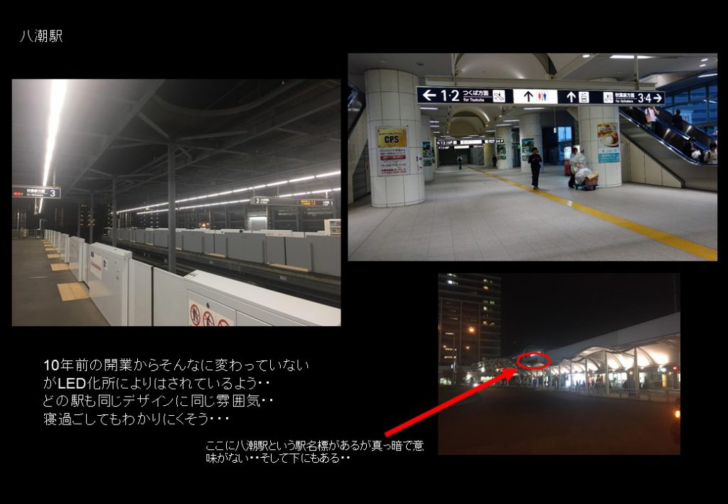
The station lighting was commented that there were many points to be improved.
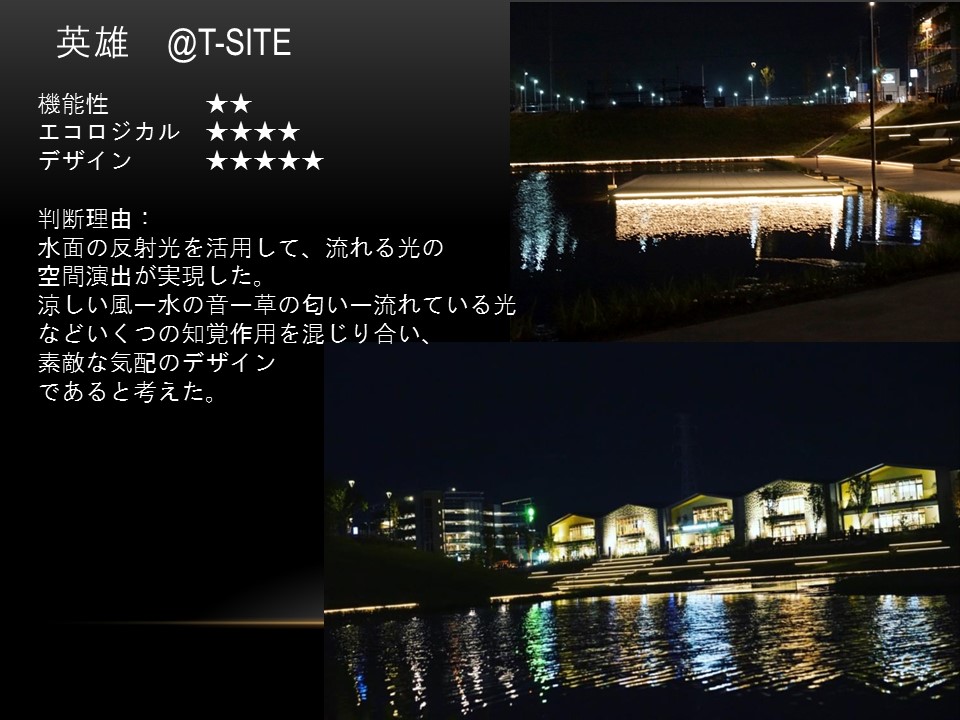
Judge by function, eco, design


