The Lighting Environment of a Cultural Hub
2022.11.25 & 26 Naoko Oguchi, Shinichi Sakaguchi, Ryuji Hatta,
Tomoya Furukawa, Azumi Okubo, Mutsuo Honma
For the first time in three years since 2019, we held a night walk survey where everyone gathered in one location.
Under the theme of “Lighting Environments in Cultural Hubs,” we explored two cities: Shimokitazawa in the Kanto region, where a series of exciting new developments have recently been completed, and Kobe in the Kansai region, known for its stylish urban atmosphere.
Before the arrival of full-fledged winter, we conducted our first large-group night walk survey in about three years. The theme was “Lighting Environments in Cultural Hubs,” held in two locations: Shimokitazawa in eastern Japan and Kobe in the west.
In Shimokitazawa, participants were divided into four groups. Two started from Odakyu Line’s Setagaya-Daita Station and the other two from Higashi-Kitazawa Station, each heading toward Shimokitazawa Station on foot.
In Kobe, the walk began after taking in the nightscape from the summit of Mt. Rokko.
■Shimokitazawa – Group 1
Group 1 walked the route from Setagaya-Daita Station to Shimokitazawa Station. The path from Daita Station to the onsen ryokan “Yuen Bettei” was composed of modest stand lights and uplights on the trees, creating a lighting environment that felt calm and atmospheric. While the pole lights were somewhat glaring, their low color temperature provided a unified tone that made the glare less bothersome. Considering safety, the overall brightness felt appropriate, and the area was deemed a hero overall.
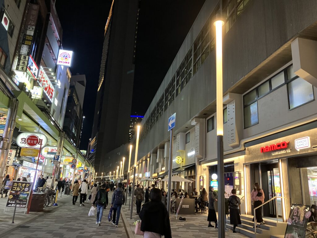
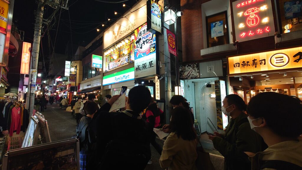
After passing through the low-rise commercial complex BONUS TRACK (where we were joined by Group 2), we headed toward the old shopping street Shimokitazawa Ichibangai. The traditional streetlights here had a high color temperature and clashed with the warmer tones of the storefronts, earning them the label of villain.
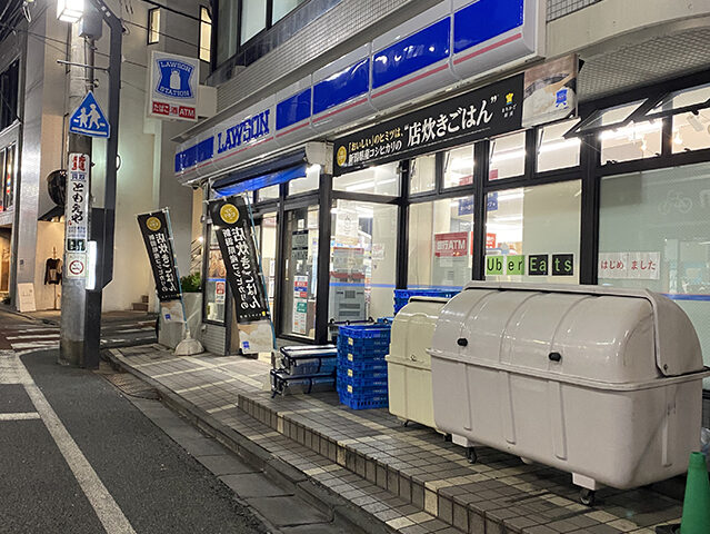
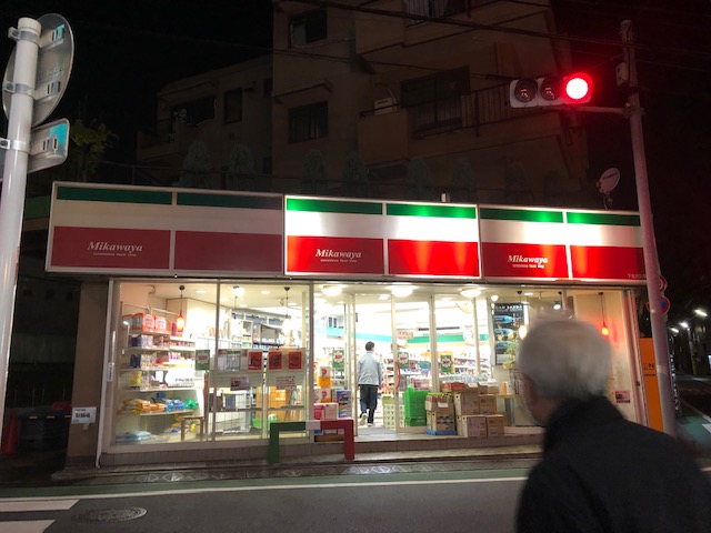
We also encountered two contrasting convenience stores: one had multiple broken lamps and appeared poorly maintained—this one was deemed a villain. The other, however, had intentionally dimmed signage and partially turned-off interior fixture lights, clearly showing an effort to conserve energy—this one was viewed as a hero.
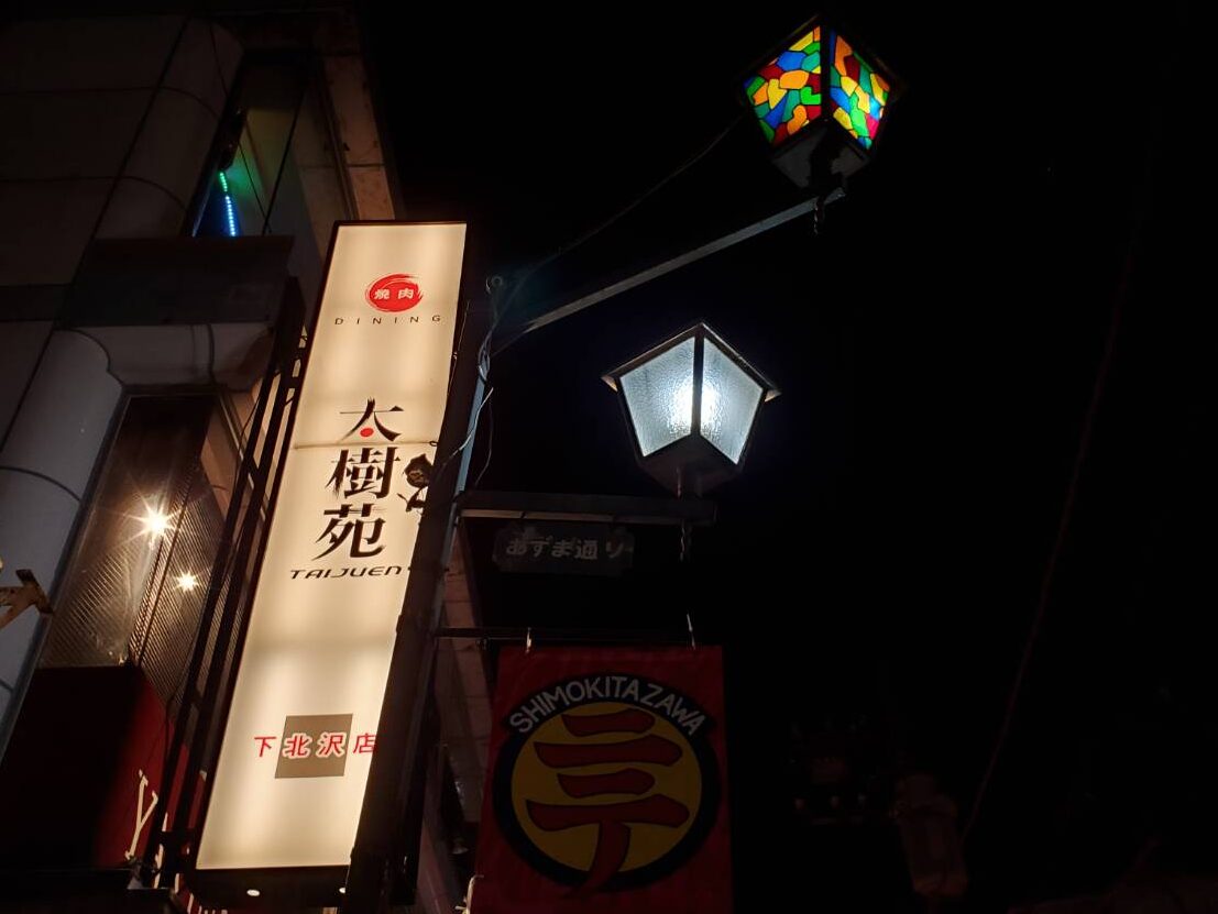
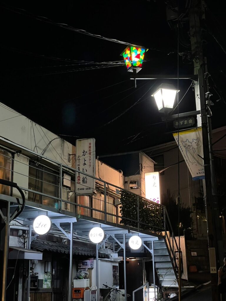
In contrast to the streetlights in Ichibangai, the stained-glass-style streetlights in the Shimokitazawa Higashi-kai area received high praise. Their nostalgic and retro aesthetic matched the character of the area, earning them the title of hero.
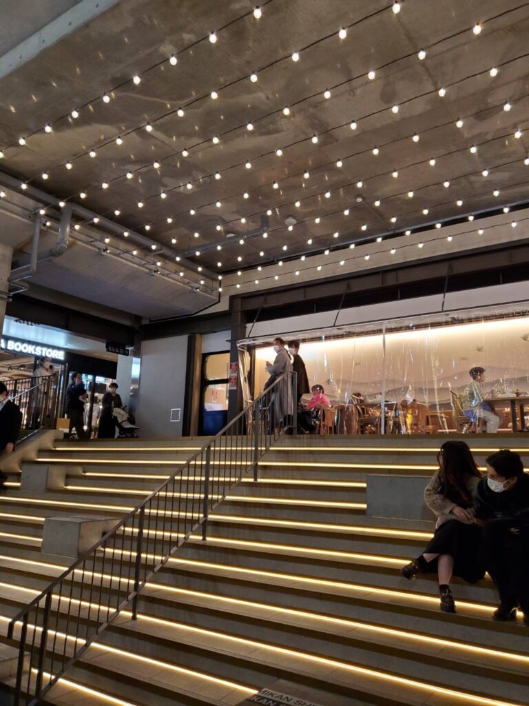
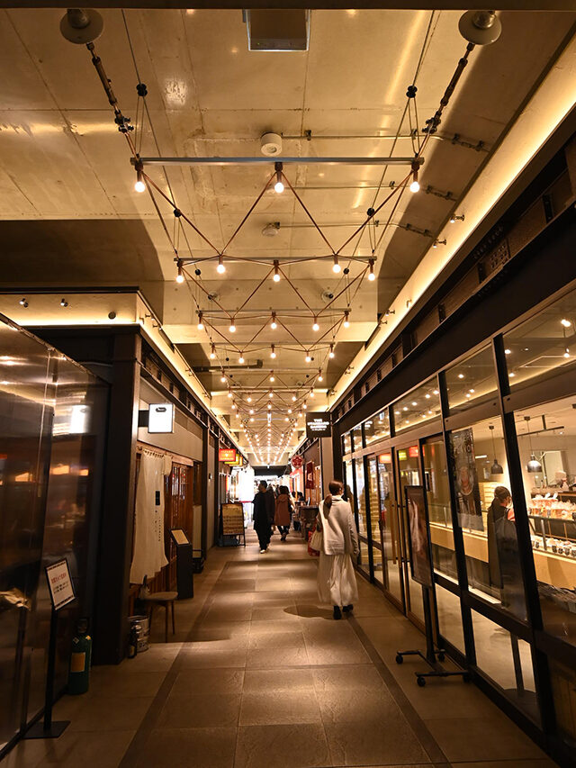
Our final stop was Mikan Shimokita, a commercial facility that opened under the elevated railway tracks in July 2022. Here, decorative lighting such as string lights with bulb-shaped lamps, illuminated staircases, and vibrant neon signage inside the stores created a photo-worthy lighting environment, clearly designed to impress and engage.
True to Odakyu Electric Railway’s concept of “support-type development,” this night walk survey offered glimpses of a city that preserves its traditional charm while allowing both locals and visitors to actively shape its future. (Naoko Oguchi)
■Shimokitazawa – Group 2
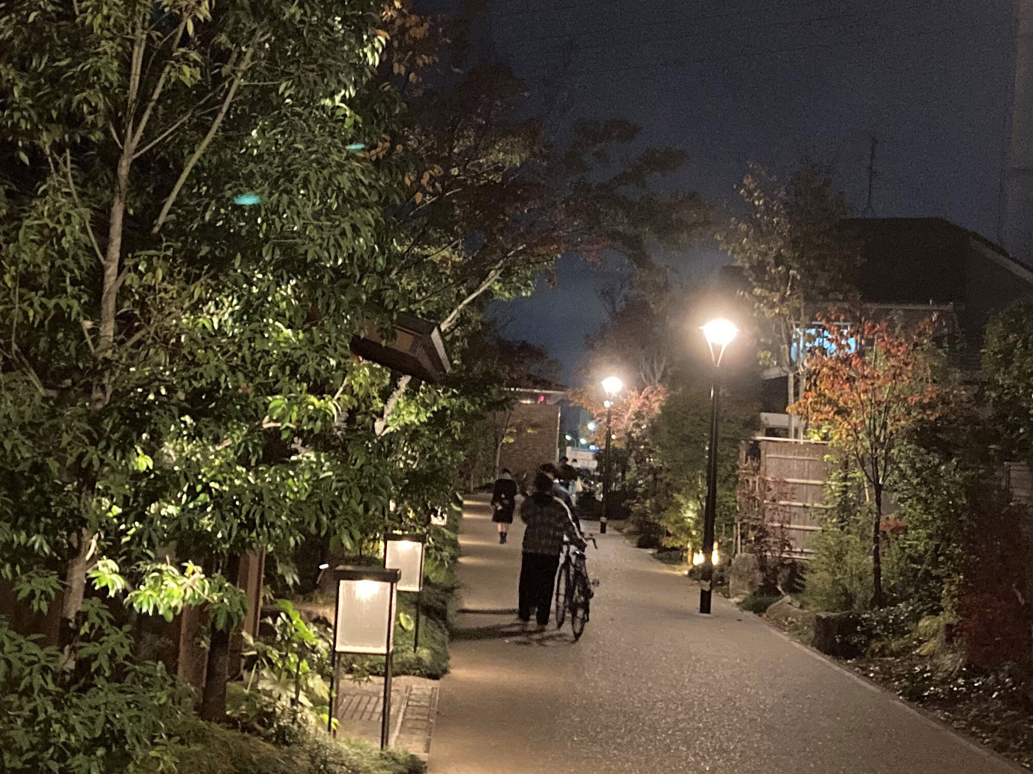
Like Group 1, Group 2 began their night walk survey at Setagaya-Daita Station and followed the course toward Shimokitazawa Station. The area in front of Setagaya-Daita had a calm atmosphere lit by warm white light, and the group walked along a street where an onsen-style inn is located. The lighting combined custom-made, low-position lantern-like fixtures with diffused light from pole lamps. Some participants felt that the low level lighting alone would have been more atmospheric and beautiful. However, considering the need for safety near the station, it’s understandable that pole lights were installed to ensure an illuminance of 15 lx on the ground.
A short walk led to the BONUS TRACK shopping street, a lively area in Shimokitazawa that opened in 2020—marking the first large-group night walk survey there in three years. Hanging bulb-style catenary lighting and candle-inspired fixtures added a playful nighttime atmosphere, earning “hero” status from many participants. On the other hand, the signage in this area was
criticized as too glaring and was deemed a “villain.”
The commercial area near Shimokitazawa Station featured lighting that many described as “visually chaotic.” Still, some argued that this jumble of light is part of Shimokitazawa’s charm and identity. One element that sparked debate was the stained-glass-style streetlight. Some praised its uniqueness, while others felt the double-arm design diminished its aesthetic value, with comments like “You wouldn’t see something like this built today.”
On the Keio Shimokitazawa Station side, many commercial facilities used exposed bulb lighting, a technique seen throughout this course. Though the light sources were LED, they evoked a nostalgic feel. The lighting across the area seemed to embrace and celebrate eras of Japan—Showa, Heisei, and Reiwa—creating a uniquely layered atmosphere of time and memory. (Ryuji Hatta)
■Shimokitazawa – Group 3
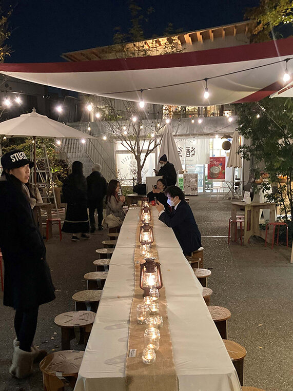
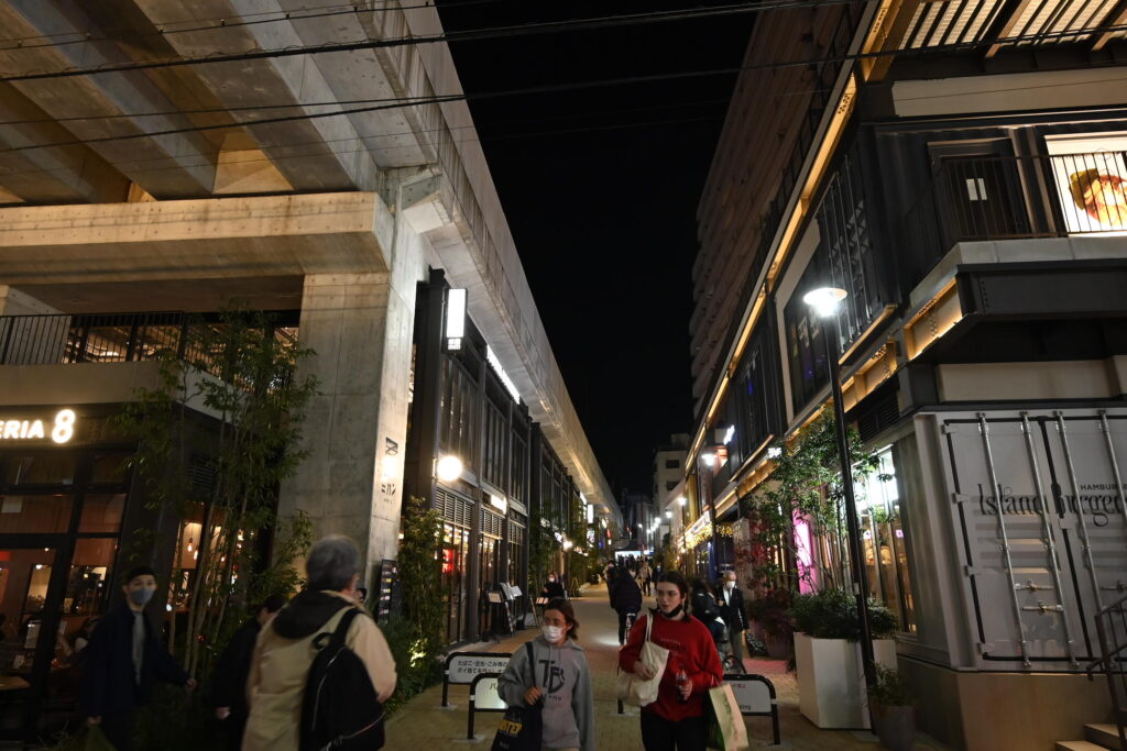
Group 3 surveyed the area around Shimokitazawa Station, starting from the west side of Odakyu Line’s Higashi-Kitazawa Station. Midway between the two stations lies reload, a low-rise, multi-building commercial complex. This open-air cluster of white buildings, adorned with generous greenery, was enveloped in soft ambient and accent lighting that created a warm, welcoming glow.
Highlights included a Christmas tree decorated with an unusual yellow-green LED that made its fine leaves appear to glow, as well as a barber shop whose blue signage and indoor spill light lent a moody feel to the facade. In contrast, a vintage clothing store emitted stark white light from its window facing the walkway, disrupting the overall ambiance. Other notable findings included tree uplighting that cast distorted shadows on building walls and string lights abandoned amidst the planting.
The team then moved on to the Shimokitazawa Ichibangai Shopping Street, known for its shutter gallery and the annual Tengu Festival. This traditional shopping street, lined with long-established stores, evoked nostalgia. However, near the street’s end, an overhead digital signboard emitted excessive, high-brightness light that stood out harshly against the nightscape, ultimately spoiling the otherwise pleasant atmosphere—an unfortunate “villain” moment.
The newly developed commercial complex Mikan Shimokita, built under the Keio Line railway tracks, received unanimous praise as a “hero.” The intersection with Azuma Street under the viaduct is brightly illuminated, eliminating dark corners and creating an inviting, open space.
Usually, areas beside elevated train tracks are overlooked, but here, the parallel access road was carefully planned and fitted with linear lighting. The result resembled the polished look of an outlet mall, generating excitement. A passage lined with restaurants incorporated symbolic design elements from railway infrastructure, such as insulators and exposed cables, giving it a rhythmic, well-balanced lighting that gently illuminated the floor.
The vibrant lighting and interior design of eateries—including a well-known bakery and a diverse range of international restaurants (Thai, Taiwanese, Korean, and Vietnamese)—naturally drew the eye and invited visitors into a lively and joyous nighttime experience. The walk left such a strong
impression that many expressed a desire to return and explore Shimokitazawa at a slower pace next time. (Tomoya Furukawa)
■Shimokitazawa – Group 4
Group 4 walked from Higashi-Kitazawa Station to Shimokitazawa Station, focusing mainly on areas where the atmosphere of the town had significantly changed due to the railway’s undergrounding and elevation, as well as places where the old-fashioned charm remains.
The newly developed area along the former railway tracks featured generally low color temperature lighting and moderate illuminance, creating a calm ambiance. Outside these development zones, there were brighter commercial areas bustling with activity, so a mix of tranquil and lively lighting environments coexisted. However, it was clear that all these areas had lighting plans designed with
specific concepts in mind. While there were many “heroes” (successful lighting examples), some challenges were noted, such as tree uplighting that cast distracting shadows on buildings, illustrating the difficulty of such installations.
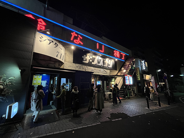
In areas a bit further from the railway corridor, many places retained a strong nostalgic Showa-era atmosphere, exemplified by the retro vibe of The Suzunari theater and nearby street lamps incorporating stained glass, evoking a warm, reminiscent mood.
Regarding the area around Shimokitazawa Station, it was suggested that comparing the current usage of the former railway site with similar cases, such as the Tokyu Toyoko Line’s Shibuya station site, could be insightful. Revisiting locations previously surveyed and comparing them with old data may reveal new findings about how much the town has transformed. (Shinichi Sakaguchi)
Kobe
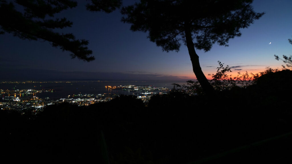
The nightscape of Kobe is considered one of the three great nightscapes of Japan. This night walk survey began with a distant view of this stunning scene. The view from the summit of Mt. Rokko, resembling a pointillist painting, was undoubtedly a “hero” moment. Among the many lights, the scattered orange hues illuminating the port facilities left a particularly strong impression. These orange lights are likely high-intensity discharge lamps of the sodium variety. While such lights may often come across as harsh and even villainous up close, when seen from afar as part of a dotted composition marking the boundary between sea and land, they revealed a unique charm. On the other hand, vibrant RGB lights in primary colors felt out of place, even from a distance.

Following that, we moved from the summit of Mt. Rokko into the city of Kobe with the intention of “zooming in on the lights that made up the pointillist painting.”
While the distant view revealed heroic elements in the way the lights of Osaka and Kobe densely clustered and scattered like a dot painting, the close-up view offered an entirely different kind of charm: Kobe’s stylish atmosphere and the lighting design that beautifully enhances it. Heroes could be found throughout the cityscape. One particularly delightful discovery was the use of Louis Poulsen fixtures in streetlights. Normally, such iconic fixtures might clash with the surrounding townscape due to their distinctive form, but in Kobe, it felt like a perfect marriage.
However, even in this sophisticated city—resiliently rebuilt after disaster and rich in enduring cultural charm—some “villains” have emerged. Villain among them: the glaring RGB lights in saturated primary colors. These violent bursts of color, which already felt out of place when seen from the mountaintop, revealed their full criminal nature up close—blatantly disrupting the mood and aesthetic of the city.
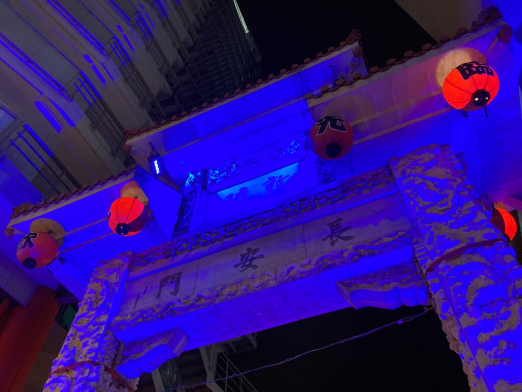
For example, at the symbolic gate marking the entrance to Chinatown, the garish primary-color RGB lighting completely disregards the gate’s original colors, resulting in a baffling and discordant effect. It doesn’t match the gate’s true character at all. The mismatch feels as jarring as sprinkling shichimi pepper into a rich glass of Pinot Noir—two strong elements that simply do not belong together. Personally, I quite enjoy spicy food, and I especially like Kyoto’s kuro-shichimi. A dash of it on udon adds a delightful aroma and enhances the broth. But never would I consider adding it to wine—which I also love. I think most people would feel the same. That’s because both the wine and the spice are bold in their own right, but they exist in entirely different worlds. The same goes for RGB lighting. It might suit certain types of urban scenery, but carelessly blasting vivid primary colors onto objects whose original appearance and hues are already distinctive only results in mutual cancellation. Rather than complementing each other, both elements undermine one another —ultimately obscuring what makes each beautiful.
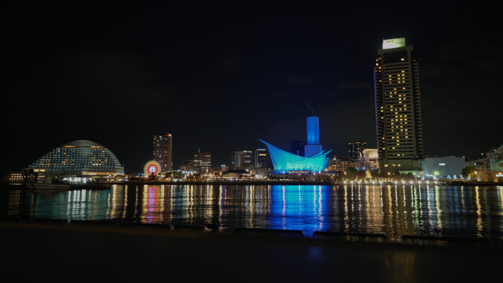
At Meriken Park as well, we were again confronted with the transgressions of RGB lighting in its most primary and unrefined form. The Kobe Maritime Museum, located in the park, is a structurally stunning building—its design reminiscent of a Santiago Calatrava masterpiece. If one were to light it properly, the fundamental principle of lighting design would be to enhance and honor that sculptural beauty.
However, using RGB lighting that cycles through colors as if to showcase the technological prowess of LEDs diminishes the structure’s inherent elegance. This kind of disjointed, colorchanging illumination feels completely out of place—like it’s from another world—and only serves to dilute the richness of the museum’s architectural form. Moreover, these kinds of lighting choices, with their overpowering visual identity, tend to flatten the uniqueness of a place. When used indiscriminately, they homogenize the landscape—making everything look more or less the same. Yes, it’s true that such lighting schemes may be “Instagrammable,” but at what cost?
Color projection that lacks meaning was a problem we also saw during the previous night walk in Osaka’s Nakanoshima district. These are not just cases of light pollution—they could be called color pollution. Urban lighting shouldn’t aim only for visual spectacle or “shareability.” Instead, it should show respect for what it illuminates. The goal must be to highlight and elevate, not overshadow. That respect—an awareness of what light is touching—is the essence of thoughtful lighting design.
Even in today’s world, where tensions are flaring up across the globe and conflict often seems just a hair trigger away, if we can simply remember to respect one another, then even if disagreements arise, they need not escalate into war. Peace can be preserved. It is this spirit of respect that paves the way to peace. Let us share that message—beginning with the field of lighting design. (Azumi Okubo, Mutsuro Honma)
