12 May 2004
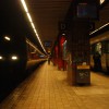
The Minato Mirai Subway Line connects Yokohama Station to Yokohama China Town five stops away. Four different architects were commissioned to individually design four of the stations on this new subway line. Although all of the stations have the same structural features, the purpose of our survey was to see how each architect, from the same starting point, reacted to design a unique station in terms of materials, color, and light.
Minato Mirai St. / Kunihiko Hayakawa


All the stations along the line are designed with the platform on floor B3 and the ticket wicket on B2, from there you climb to ground level, but at the Minato Mirai Station the shopping center, Queen’s Square, is on the ground floor. Using this to an advantage, the main feature of this station is strategically placed atriums, making it possible to view the shopping center 3 floors up from the platform and vice versa. The openness and air circulation from the high ceilings help to create a comfortable station atmosphere. The main colors and materials of this station are red, yellow, matte silver, and blue aluminum. The colors and materials were used to form horizontal axes throughout the station, emphasizing the speed and efficiency of the subway line. The entire station is basically illuminated in white light, but a more sunlight-beach influenced color might be more appropriate for this hot date spot, popular with the younger crowd.
Bashamachi St. / Hiroshi Naito
Compared to Minato Mirai Station, Bashamachi Station is a calmer, more collect environment. The old Yokohama Bank brick wall and other neutral colors and materials, such as brown, charcoal gray, and white, used throughout the design of this station, are more suitable for the mature downtown crowd of Yokohama. The old brick wall is illuminated in warm, white light, beautifully displaying the properties of this material. Throughout the station, warm, white color lamps are used in places where the ceiling is lower and white color light in more open areas. Just this subtle difference emphasizes the simplicity of the color scheme, materials, scale, and form of the station.
Motomachi-Chukagai St. / Toyo Ito
The next station, Motomachi-chukagai, is the station version of a trendy cafe. From the ticket wicket, the escalator leading down to the platform is a narrow space with all-black walls, which suddenly opens up to the all-white platform. The first impression is of a bright, white space with black and white faces floating along the walls. Finished in a smooth, glossy material, black and white pictures of historical Yokohama and its residents line the all-white platform walls. The walls and its graphics are the main focus of this station, as the lighting is also directed to lightly wash the walls, The vertical illuminace level along the walls is higher than on the floor of the platform making the pictures clearly visible while waiting for the train.
Even though these stations are all structurally similar, the theme, colors, and materials used, made each station a unique experience. Also, depending on what each architect wanted to emphasize, I realized the importance of a well-designed lighting plan.